Typography
Session 3: Typography
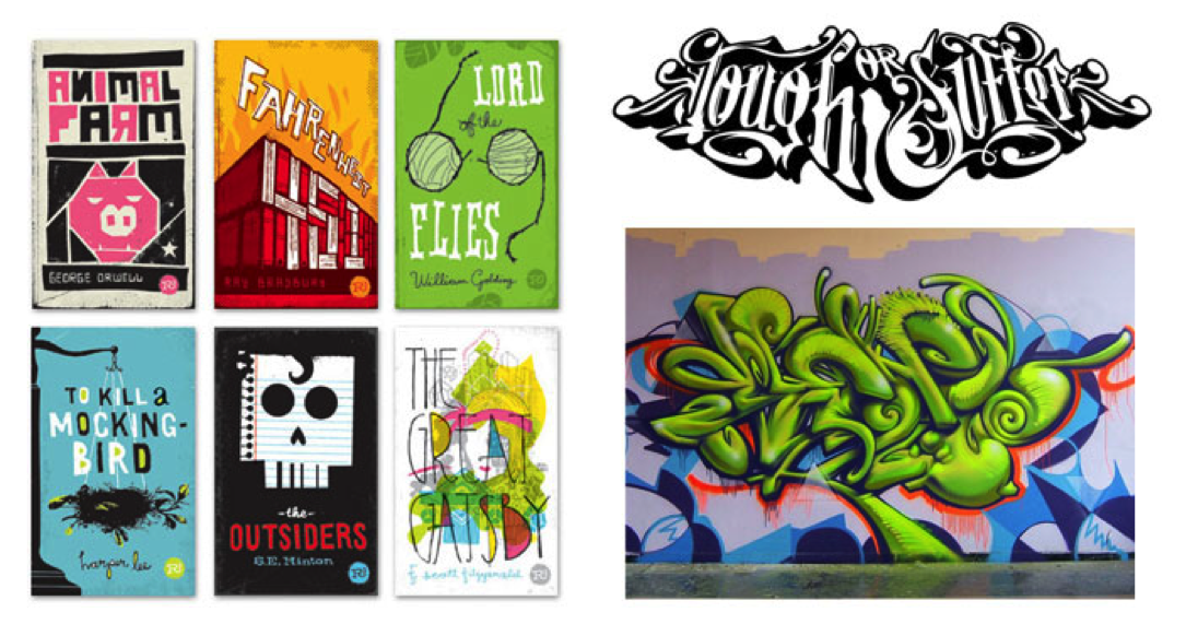
Decorative Type
|
Text can have a number of different purposes in a design. It can be used for pure graphic appeal, a case in which readability may be less important than aesthetics. An example of the graphical use of text is in titles, logos and trademarks.
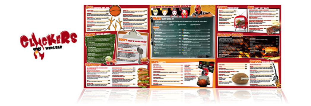
Text may also be used for communication of information rather than for visual effect, in which case, legibility is always the priority of the designer. A few examples of usage of text for linguistic communication are: the body text of an article or book, the text of a restaurant menu, or in product descriptions in a catalog.
A typeface may be used either successfully or poorly, depending on its degree of relevance in the project and the skill of the designer. The designer must pay careful attention to letter, word, and line spacing as well as the size of the typeface and its stylistic contribution to the overall aesthetic feel of the project. They must optimize the properties of the text for its purpose in the overall design (aesthetic or communicative) and maintain legibility where it is necessary. The designer is also expected to add visual variety with formatting and layout, as well as possible typeface changes where applicable. |
|
 Try This: