Typography
Session 3: Typography
Readability
|
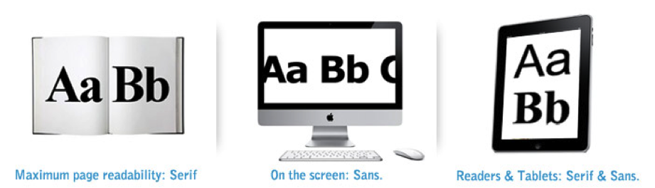
A designer has to choose a typeface that is not only appropriate to the mood of the design, but that is appropriate for the text's purpose in the design. Standard graphic design wisdom holds that of the classifications of serif and sans-serif, serif fonts are easier to read. This is because when reading, the eye quickly scans the tops of the letterforms and a serif font has more immediately recognizable features thanks to the tiny 'eye-holds' provided by the serifs. There is a notion slowly gaining acceptance that for the purposes of purely electronic design, the reverse is sometimes true. Sans-serif fonts are more readable in this case because a screen has a lower resolution than a printed page, so the serifs only serve to smudge the letter forms. As screen resolution improves and technology improves, both are being used more commonly depending on the application.
Some typefaces, such as Times, originally designed for the London Times newspaper, or Futura, designed as a letterpress (raised plate) type for printing on paper, were intended for the printed page. Others such as Georgia and Verdana were designed for the lower resolution of text on a screen. The shapes of these typefaces are developed to optimize visibility in smaller sizes on a computer monitor. In larger sizes, these differences don't matter as much. LineWords are joined to form verbal sentences and typographic lines. The configuration and placement of lines of type are significant structural concerns. In its most basic form, a line of type consists of a single point size and a single weight extended horizontally over a specific line width.
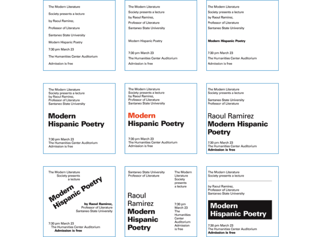
HierarchyA visual hierarchy is an arrangement of elements in a graduated series, from the most prominent to the least prominent, in an area of typographic space. When establishing a visual hierarchy, a designer carefully considers the relative importance of each element in the message, the nature of the reader, the environment where the communication will be read, and the need to create a cohesive arrangement of forms within the typographic space. The study of visual hierarchy is the study of the relationships of each part to the other parts, and the whole. When elements have similar characteristics, they have equality in the visual hierarchy, but when they have contrasting characteristics, their differences enable them to take dominant and subordinate positions in the composition. Here is the same content demonstrating visual hierarchy.
|
|

 Try This: