Typography
Session 3: Typography
Sizing and Spacing
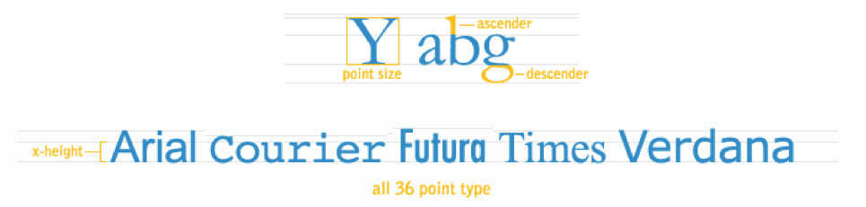
Typeface SizingKeep the typeface at a reasonable size for reading. The numbered size of a typeface may reflect the overall height of the lines that stick out of the type, but not the readability size that relates to the inner dimensions of the letters. The type size should be chosen on a visual basis, and not purely on that of font size numbers. Usually, type that is proportioned so that the lower case size is larger in proportion to the overall height of the font, can produce a greater amount of legible words into an equivalent space.
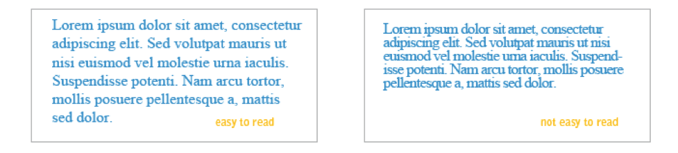
Typeface SpacingWord spacing should be so that the reader is aware of the beginnings and endings of words with little or no difficulty. Experiment with spacing settings to find the best one. Letter spacing and line spacing may be used to expand on the expressivity of the font. Leave enough space between the lines so that the text is legible. Experimentation is important here, too. The reader's eyes should be pulled to the next word as they read, not to the lines above and below. The letter spacing should be that so the reader can easily differentiate between different characters. Experiment, experiment, experiment. KerningKerning is the horizontal spacing between exactly 2 glyphs. When you are hand kerning text (logotype or headline text usually) try to imagine that the baseline and glyph shapes make a container, and imagine pouring water in. Try to make the negative space between each pair of glyphs hold the same amount of water. Click on the image below to try an interactive activity to help you understand kerning:
TrackingTracking is the horizontal space added to or subtracted from the space between each and every pair of glyphs in a selection. In other words, tracking adds to or subtracts from the kerning of all pairs of glyphs in a selection.
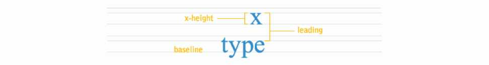
LeadingLeading is the vertical spacing between separate lines of type. There is a relationship between the length of the line and the amount of leading needed for easy legibility. Longer lines need more leading to prevent the reader's eye from slipping up or down when moving from the end of one line to the beginning of the next. It then logically follows that short lines are preferable if information density is important, as in a newspaper. LayoutA good layout is one that shows good use of the elements and principles of design. Most importantly, a designer should use the principles of design to draw the reader's eye both to and through the design easily. To refresh you the elements of design are: color, value, texture, shape, form, space, and line. The principles of design are: contrast, emphasis, balance, unity, pattern, movement, and rhythm. The specifics of both the principles and elements vary from source to source, but the idea remains the same. Type and VisualsType is usually designed with other visual elements, such as photographs, illustrations, graphs, and graphics. The relationship between typed and visuals is crucial, it should be synergistic. When the cooperative action between type and the visuals is created, the design becomes a cohesive unit. In addition to understanding the fundamentals of design and how they relate specifically to designing with type, it is essential to understand how type can be used creatively and expressively. Used in conjunction with the visual, type is often the verbal part of the design message. However type can be the visual itself and can express the entire message. Below are two examples of how type is the main element used to animate a message.
|