Lesson 1: Sketching and Interpreting Graphs
Module 4: General Relations
Connect
 Lesson Assessment
Complete the lesson quiz posted under the Assess tab or by using the Quizzes link under the Activities block. Also, ensure your work in your binder (course folder) is complete.
 Project Connection ** NOT ASSIGNED**

© iofoto/shutterstock
In this module you are focusing on sports and recreation. You may choose to answer the questions or contact your teacher if you would prefer to create a graph about a different scenario of your choice.
In hockey, there are many events that can be graphed—for example, number of wins for a team, number of goals for a player, number of penalty minutes. The graphs can help players, coaches, and fans see patterns and trends in the numbers. These patterns allow people to make more informed decisions.
Now it is your turn to create graphs. Your graphs may be based on hockey, or you may choose a sport or recreational activity that is of more interest to you.
Go to the Unit 3 Project, and complete the Module 4: Lesson 1 component.

© DPiX Center/shutterstock
 Going Beyond
In 2009, the H1N1 flu was a large concern. The following graph illustrates the course of the H1N1 flu virus outbreak in Canada. (The graph, produced by the Public Health Agency of Canada, is current as of June 8, 2009.) The illustraton shows either the date when symptoms of the H1N1 flu virus began or, if this date was not available, the date when a specimen was collected for each of the laboratory-confirmed cases.
H1N1 Flu Graph
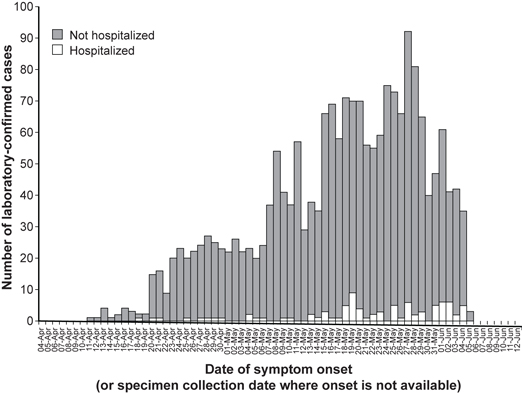
Source: Date of Symptom Onset,  , Public Health Agency of Canada, 2009.
Reproduced with the permission of the Minister of Public Works and Government Services Canada, 2010.
Click here to view a larger image.
- When reading a graph such as this one, what do you think is important to keep in mind?
- What are some possible sources of confusion or misrepresentation?
Perform an Internet search for other graphs that show growth over time. You may find a graph that also provides data from the health sector, or you may find a graph that could be from another industry.