Lesson 3
1. Lesson 3
1.10. Lesson 3 Summary
Module 3: Algebra
Lesson 3 Summary

Wavebreak Media/Thinkstock
In Focus of this lesson, you discovered how some products are linked to an increased risk of health issues. However, there is rarely a definite indicator that the product is the actual cause of the health issue. Since there are often many variables to consider in research studies, researchers can only be as confident as the data collected. This data may be graphed as a scatterplot, which will then help researchers determine if there is a correlation or trend in the variables.
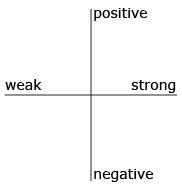
You do not have to be a health scientist to work with scatterplots, correlation, and lines of best fit. You only need to have an inquiring mind to determine if one thing affects the results of another. For example, what kind of correlation is there between the time you spend studying and your success with the course—positive or negative? weak or strong? Which quadrant would you place an X in to represent the correlation in question?
In this lesson you looked at examples of scatterplots and determined if a line of best fit can be drawn to represent a trend. When most of the points lie along a straight line, the correlation is strong. If not, the correlation is weaker. From the line of best fit, you can interpolate and extrapolate to help make decisions about the data that is presented to you in a scatterplot.