Elements of Design
Using Value
Two major considerations are significant when using value:
- Amount of contrast, which controls visibility
- Tonal range, which controls mood and ambiance
The range of values from black to white is the tonal range available to a designer. By using that range effectively, the designer can determine the mood of an image and create and control the ambiance. Ansel Adams was a master at using tone effectively. He said that a photographer should make a picture, not just take a picture. Visit the Ansel Adams Gallery online and look through his work. Note how his pictures evoke mood and time.
The categories of value determine the amount of contrast.

The black bar below is clearly visible against the white background but barely visible against the black bar. The contrasts are reversed with the light gray bar. The dark gray is equally visible against both black and white, but not as visible as the high contrast areas of the first two bars. The fourth bar (graduated from black to white), has maximum contrast at either end. .
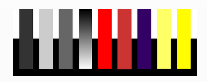
The violet bar corresponds to the first dark grey bar in contrast (high against white but low against black). The two yellow bars correspond with the second light grey bar in contrast. The brighter yellow bar is more visible even against the white. However, contrast is still low. The yellow is noticeable only depending on the background. Against black, the yellow bar has both strong value contrast and strong colour appeal.
Value scale: A scale that shows the gradual change in value from its lightest value to its darkest value (white to black) is a value scale.
Graphic art is one of the few places where one can afford to take chances. The unexpected has a premium! Take the time to experiment. You can learn as much from your failures as you can from your successes.