Principles of Design
Contrast
Contrast occurs when two related elements are different. The greater the difference, the greater the contrast. Contrast adds variety and promotes unity. It draws the eye into the composition and guides the viewer around the composition.
To create contrast in composition, designers use contrasting colours, sizes, shapes, locations, or relationships. To create contrast in text, we can mix serif and sans-serif fonts, use various font styles, or use fonts in surprising or unusual ways.
Contrasting Colours
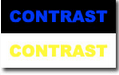
Contrast is the perceived difference between two adjacent colours. Black and white represent the highest level of contrast, but they are not colours. They are said to represent achromatic contrast, which means no colour contrast. Complementary colours (colours directly opposite on the colour wheel) represent high chromatic contrast. Contrasting complementary colours makes them stand out more vibrantly. Notice the high contrast produced by using black/white and blue/yellow.

Warm colours are perceived as advancing out of the screen slightly, but cool colours seem to recede.
Keep the Contrast Simple
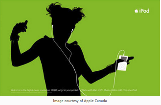
Image courtesy of Apple Canada
Contrasting Text and Backgrounds
|
Developing contrast with text can be as simple as making one word bold or italic so that it will stand out from the remainder of the sentence.
|
 |
On a computer screen, black text on a white background is preferred. It produces the greatest amount of contrast and is best for most readers. |
|
Readability degrades as the level of contrast diminishes, and lettering without sufficient contrast may be hard on the eyes.
Notice how difficult it is to read the black/blue and white/yellow CONTRAST examples.
|
 |
Coloured backgrounds that include patterns and textures also can be problematic.
Contrast with Size
Large and small elements of the same category, such as large and small images and large and small type, are the most obvious uses of size to produce contrast.
As contrast in size diminishes, the effect of the contrast decreases.