Typography
Decorative Type
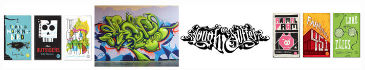
Text can have several purposes in a design. Variations in text can be used for pure graphic appeal. Sometimes, readability may be less important than aesthetics. Examples of using text for graphical appeal include the use of text in titles, logos, and trademarks.
Many decorative typefaces are poor choices for the main body of an article because a purely decorative typeface distracts from the content of the message and tires the reader's eyes when it is over-used. Our eyes are most comfortable reading less distinctive typefaces.
Decorative typefaces (larger than 14 points) are well suited for display type. Simpler typefaces (smaller than 14 points) are well used for text. To maintain readability in large blocks of text, the writer should stay consistent and use only one typeface family.