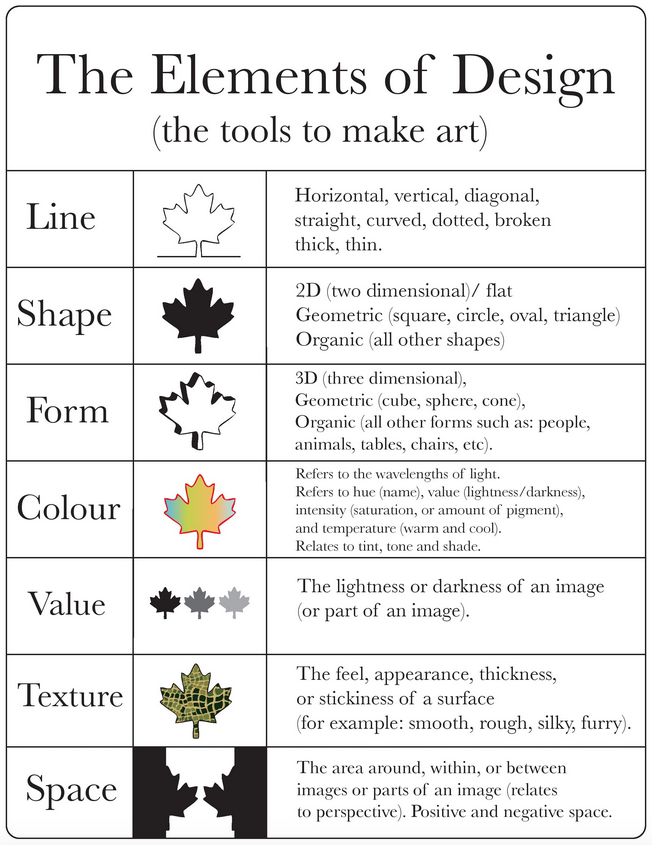
Elements of Design
| Site: | MoodleHUB.ca 🍁 |
| Course: | Introduction to Online Learning |
| Book: | Elements of Design |
| Printed by: | Guest user |
| Date: | Wednesday, 3 December 2025, 4:03 PM |
Introduction
Although we can use digital technology to explore solutions to design problems in greater detail and in less time, the solutions must address the elements of design. However, seldom is only one way available to apply each element. Experimentation is key.
- line
- shape
- form
- space
- value
- colour
- texture
Line
A line is a dot or point moving along an open path. It is the mark made by a tool as the tool is drawn across a surface. The tool could be a pencil, a brush, a mouse, or even a finger. Line attributes refer to the way lines move from beginning to end. Lines may be straight, curving, or angular. Lines alone or in combination with other design elements can aid in the readability, appearance, and message of a design. All lines have direction and quality.
Line direction refers to line orientation to the page. Horizontal lines move across the page. Vertical lines move up and down on the page. Diagonal lines look slanted in comparison to the edges of the page.
Line quality refers to how a line is drawn. A line may be delicate or bold, smooth or broken, thick or thin, regular or changing.

Types & Uses
Lines define shape, contour, and outline, and can suggest mass and volume. Lines can divide or unite elements on a page.
Diagonal lines and arrows can denote direction. Lines at the top, bottom, or sides of a page can provide an anchor to hold elements in place. We use
several types of lines in basic ways.
- Organize
- Texturize
- Guide the eye
- Provide movement
- Make a statement
- Convey universal meanings
- Outline (lines made by the edge of an object or its silhouette)
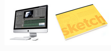
- Sketch (lines that captures the appearance of an object or impression of a place)
- Contour (lines that describe the shape of an object and the interior detail)
- Gesture (lines that are energetic and catch the movement of an active figure)
- Calligraphic (precise, elegant lines done by hand; from the Greek word meaning beautiful writing)
- Implied (lines not actually drawn but suggested by a group of objects seen from a distance; the direction an object is pointing to, or the direction a person is looking)
Shape & Form
Shape and form are areas and masses that define objects in space. A shape is an area that stands out from the space next to or around it because of a defined or implied boundary or because of differences of value, colour, or texture. In two-dimensional design, shapes possess width and length.

When shapes possess volume, they become three-dimensional and are described as forms. Shapes and forms in visual communication can be used to add interest, style, and theme to designs.
There are many different ways to depict shapes in two dimensions or forms in three dimensions. One common way is with lines. Lines can be used to produce a shape such as a triangle, or a form such as a pyramid). Shapes and forms can be open or filled with colour, tone, or texture. How a shape or form is drawn gives it a quality. Shapes and forms may be curving or angular, regular or changing, flat or volumetric, etc.
Categories of Shape & Form
There are four categories of shape and/or form configurations:
- Geometric (circles and spheres, squares and cubes, triangles and pyramids, etc. which are common in architecture and manufactured items)
- Organic (seashells, flowers, leaves, etc. which are common in nature, and have characteristics that are free-flowing, informal, and irregular.)
- Dynamic (shapes that appear moving and active)
- Static (shapes that appear stable and resting)
Shapes may be combinations of these categories. The shape of a leaf, for example, can be organic and dynamic as it apparently falls from the tree. It can be organic and static if it simply "hangs on" during a calm day!

Shapes and forms must reflect the intent of the message. For example, if the intent is to convey a sense tranquillity, harsh angular shapes and forms would confuse the viewer. A sense of tranquillity is more likely to be conveyed by using flowing organic shapes.
Space
Space refers to the area in which art is organized. It may have two dimensions (length and width), such as a TV screen. Or it may have three dimensions (length, width, and height), such as a TV studio. Space refers to the distances or areas around, between, or within components of a piece. Space includes the background, the foreground, and the middle ground. Space and perspective often are discussed together. Perspective is the representation of a volume of space on a flat surface.
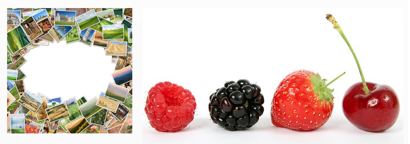
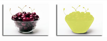
In fundamental terms, space is an area activated by other elements. Space does not exist unless other design elements are present. For example, in the visual compositions below, the space is activated by the postcard shapes in the first image and by the fruit shapes in the second.
Graphic Design & Space
Graphic design is concerned with the arrangement of elements in given spaces. Designers tend to focus on the photograph, letterforms, or illustrated subjects in their designs. But, to present those graphic elements in a visually purposeful way, designers also must consider the space around the elements. When a line or shape element is introduced into an area of space, the space is said to be activated. Space can be activated subtly or overtly.
Space in a two-dimensional drawing or graphic (shape) refers to the arrangement of objects on the picture plane. The picture plane is the surface of the medium, such as paper, canvas, or screen. A picture plane can be a crowded space with many objects, or it can be an empty space with very few objects. A two-dimensional poster has height and width but no depth. The illusion of depth can be achieved by using perspective. This is the technique used to have an image appear to be moving into the distance, such as a landscape.
Space is the three-dimensionality of a sculpture (form). A person can walk around forms, look above them, or enter them, for example. This is the space of a form. Remember that a three-dimensional object (or form) has height, width, and depth.
Kinds of Space
There are two kinds of space, and both play important roles in visual compositions.
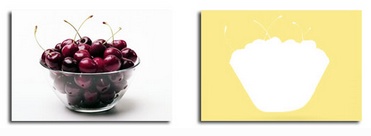
| Positive space: In an image, the positive space represents the subject matter. The original image is the bowl of cherries. Positive spaces are the solid forms in a design, as shown in the green area below. |
Negative space: In an image, the negative space (also called white space) is the area around the positive shape. The original image is the bowl of cherries. The negative space shown below is the yellow area around the bowl of cherries.
|
 |
 |
The presence of space on a picture plane affects how we interpret a visual composition.
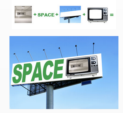
| Picture plane: The flat surface where the image will be displayed (such as computer monitor, drawing paper, canvas, TV) is the picture plane. |
Composition: The organization and placement of the elements on a picture plane is the composition. These four elements are compiled to make the "SPACE" composition below.
|
 |
 |
Foreground & Background
The presence or absence of positive and negative space in the foreground or background of a visual compositions also helps us to interpret what we see.
Focal point: The object or area where the viewer is expected to look first is the focal point. This is always important to ensure the right element receives the most attention.
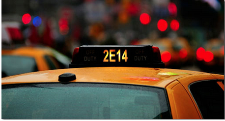
Did you look at 2E14 first? It is the focal point!
The relationship between a figure and the background is a fundamental association of a positive and negative or shape versus space. However, in a curious way, space around figures has shape, too. To orchestrate harmonic balance in the parts of the design, the designer has the critical task to achieve a sense of the relationship between the shapes of the design and the configuration of the space around the shapes.
Equally important, attention must be given to the shape of the figures and the shape of the surrounding space or background. In the first image below, the word "FLY" (spelled with cut-out images of hot air balloons) is barely discernible from the red background.
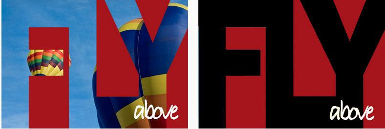
Shapes on a two-dimensional surface can be produced other than by using lines. Areas of colour (such as the red areas above), are not surrounded by lines, yet they are clear and distinct. The area of colour has a hard edge and defines the shape. The negative space around the word "FLY" is more obvious than the word itself. The text "above" contrasts well and is easily discernible in both images.
Value

Value is the design element that refers to the relationship between light and dark on a surface. In black and white images, value is referred to as tone.
Value is produced by a light source that shines on an object, eliciting highlights and shadows. Value accentuates the colour of the subject. Value results in depth within a picture, making an object appear three-dimensional with highlights and shadows. A landscape produces the illusion of depth by becoming lighter in value as the image seems to recede to the background.
The tonal range of the image provides the contrast that enables us to see what the artist wants us to see.
Value Contrast
Light values are placed next to dark values to elicit contrast or strong differences.
Using Value
Two major considerations are significant when using value:
- Amount of contrast, which controls visibility
- Tonal range, which controls mood and ambiance
The range of values from black to white is the tonal range available to a designer. By using that range effectively, the designer can determine the mood of an image and create and control the ambiance. Ansel Adams was a master at using tone effectively. He said that a photographer should make a picture, not just take a picture. Visit the Ansel Adams Gallery online and look through his work. Note how his pictures evoke mood and time.
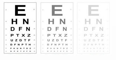
The categories of value determine the amount of contrast.
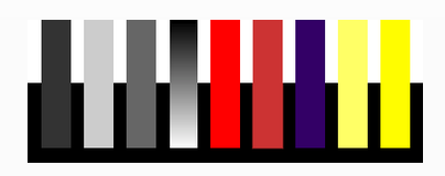
The black bar below is clearly visible against the white background but barely visible against the black bar. The contrasts are reversed with the light gray bar. The dark gray is equally visible against both black and white, but not as visible as the high contrast areas of the first two bars. The fourth bar (graduated from black to white), has maximum contrast at either end. .

The violet bar corresponds to the first dark grey bar in contrast (high against white but low against black). The two yellow bars correspond with the second light grey bar in contrast. The brighter yellow bar is more visible even against the white. However, contrast is still low. The yellow is noticeable only depending on the background. Against black, the yellow bar has both strong value contrast and strong colour appeal.
Value scale: A scale that shows the gradual change in value from its lightest value to its darkest value (white to black) is a value scale.
Graphic art is one of the few places where one can afford to take chances. The unexpected has a premium! Take the time to experiment. You can learn as much from your failures as you can from your successes.
Colour
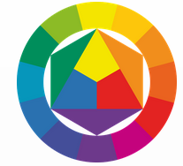 |
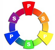
Colours are either primary, secondary, or tertiary.
|
 |
Complementary colours are opposite to each other on the colour wheel. The complementary colour of a primary colour (red, blue, or yellow) is the colour resulting from mixing the other two primary colours. For example, the complementary colour of primary colour red is secondary colour green, which is made by mixing primary colours blue and yellow. The complementary colour of a secondary colour is the primary colour that was not used to make it. For example, the complementary colour of secondary colour orange is blue. Blue is the primary colour that is not used to make orange. An easy way to determine a complementary colour is to note they are directly opposite on a colour wheel.
When placed next to each other, complementary colours make each other appear brighter, more intense. The shadow of an object also contains its complementary colour. For example, the shadow of a green apple will contain some red.
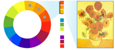
Analogous Colours
Analogous colours are side-by-side on the colour wheel. These can be used to produce colour harmony. Orange, yellow-orange, and yellow are an example of analogous colours. They are blended nicely in Sunflowers, a painting by Vincent Van Gogh. How do you know that these colours are closely related? They share a colour. Each contains some yellow.
Monochromatic Colours
Monochromatic colour schemes are derived from a single base hue, and they are extended using its shades, tones, and tints. That is, a hue is modified by the addition of black, grey (black + white), and white. As a result, the energy is more subtle and peaceful because of a lack of contrast of hue. Monochromatic colour schemes may be considered boring unless diversity is evident within the design.
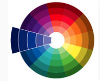 Each of the 12 slices on this colour wheel represents a monochromatic colour scheme.
The actual colour blue is shown in the middle space of the enlarged slice. The lighter and darker blue colours on either side are the result of adding more or less black or white to the original colour.

Colour Terminology
Understanding and utilizing colour effectively comes more easily to some people than to others. However, one thing is certain. The study of colour deserves attention. Colour is a powerful and highly provocative design element. It is difficult to control when producing an original work, and it is even more difficult when work is reproduced in print or viewed on a computer screen.
To fully understand colour, you must first understand the terminology associated with colour.
Colour Meanings
Research shows that colour speaks to us consciously and subconsciously. Consider the colour summaries below. Think about how you can use colour in visual composition to generate a specific response to your message.


Allow your design solution to guide your colour choices. Some colours are more appropriate than others for certain problems and brands or groups. Try not to lock yourself into using your favourite colour in all your designs. Experimentation, experience, and keen observation will help you develop your use and control of colour.
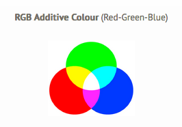
Additive & Subtractive Colour
Computer monitors, projectors, iPods, smart phones, television screens, etc. work much the way our eyes work. They emit red, green, and blue light and the combination of these three lights in various quantities and intensities produces the millions of colours we see on the screen.
This system of producing colours is called additive because the three primary lights (red, green, blue), are added together to form the white light.
In paint or pigment, the subtractive primary colours are red, yellow, and blue. Other colours result when primary or secondary colours are mixed.
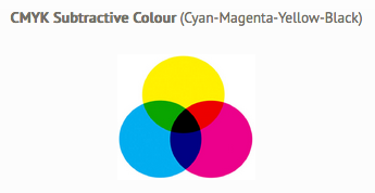
In most colour printing, the primary ink colours use cyan, magenta, and yellow. Cyan is the complement of red, meaning that cyan acts as a filter that absorbs red. The amount of cyan applied to a paper controls how much red shows. Magenta is the complement of green, and yellow is the complement of blue. Black ink is added to the mix to obtain a real black and to give more depth to printed images. This mixture is called CMYK and is
also known as four-colour process printing. Other colours are produced by dot patterns of cyan, magenta, yellow, and/or black.
![]() The Graphic Designer's Printer
The Graphic Designer's Printer
Texture
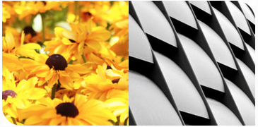
Texture refers to the real or implied surface quality of a visual composition. All surfaces have texture. Surface textures can range from the roughest mountain range to the smoothest polished mirror, much like the elephant skin and leaf surface shown on the right.

Various textures can make an image more interesting in various ways. Some surfaces are inviting; others are not. The textures that suggest those surfaces invite similar responses. However, texture is not a strong enough element to be useful for organizing a composition. Value and colour contrasts are more effective for that purpose.
Real (tactile) texture is the actual feel of a surface. This is most important in three-dimensional design (form), but it is of only moderate interest in two-dimensional design (shape). Examples of this include sandpaper, cotton balls, tree
bark, fur.
Implied (visual) texture is the illusion of the texture, or how texture appears on a 2D surface. The textures you see in a photograph are visual textures. No matter how rough objects in the photograph look, the surface of the photograph is smooth and flat.
Pattern changes to texture when we lose sight of individual motifs. This is easy to do with natural patterns, but we have to be quite far away from a building grid to see it as texture.
All patterns have texture, but not all textures have pattern.
Generally, patterns are more noticeable than textures are. This makes them a stronger visual element for controlling attention.
Summary
There are many different elements of design and each one has an impact on the visual message of a picture.
Check out the infographic below for a summary.