Principles of Design
| Site: | MoodleHUB.ca 🍁 |
| Course: | Introduction to Online Learning |
| Book: | Principles of Design |
| Printed by: | Guest user |
| Date: | Wednesday, 3 December 2025, 4:03 PM |
Introduction
The elements of design are the building blocks of visual composition, and the principles of design are how we use or arrange these building blocks. This unit introduces the principles of design as they apply to typical graphic design work. When we know how to apply the principles of design to the elements of design, we can produce effective visual compositions.
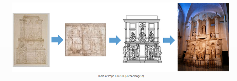
Tomb of Pope Julius II (Michaelangelo)
We apply the principles of design to all visual compositions. How we apply them determines how effectively we convey our messages. There is seldom only one correct way to apply each principle. Again, experimentation is the key.
The number and names of the basic principles of design varies. Design terms include balance, clarity, emphasis, framing, harmony, movement, unity, rhythm, perspective, variety, proportion, point of view, simplicity, repetition, and dominance.
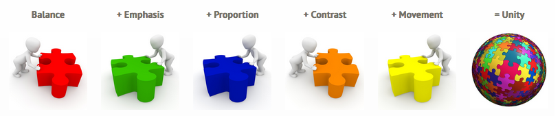
- balance
- emphasis
- proportion
- contrast
- movement
- unity
Balance
Try walking a long distance with a 2-kg bag of rocks in one hand and a 10-kg bag of marbles in the other. After a while, you'll be wanting to shift your load around, putting a few marbles in the rock bag to balance your load and make walking easier. Balance in design works in a similar fashion. Visual balance results from arranging elements on the page so that no one section is heavier than another is.
Consider three types of balance:


Symmetrical (Formal) Balance
When elements are arranged so they divide the page evenly, symmetrical balance is achieved. This is easy to see in compositions that are perfectly centred or those with mirror images. Often, symmetrical balance conveys a sense of tranquillity, familiarity, elegance, or serious contemplation. In symmetrical balance, all elements are centred within the layout. Generally, this produces a restrained, conservative look. It implies dignity, strength, and dependability.
Formal balance limits how we can position elements, but it should not limit how we decide to arrange text, art, and white space on the page.

Asymmetrical (Informal) Balance
 Asymmetry means without symmetry. Nothing in the design is mirrored or centred. The elements used could be an odd or mismatched number, or they might be elements of various sizes. Asymmetrical balance is achieved by sensing whether the composition looks balanced. Asymmetrical layouts generally are more dynamic and can generate tension, express movement, or convey moods such as anger, excitement, joy, or casual amusement.
Asymmetrical balance produces a more casual, relaxed feel in the design, and it generates interest. Informal balance allows the designer to lead the reader through the layout along the path the designer specifies.
When striving for asymmetrical balance … Consider the following:
- As an element moves away from the centre of the page, it gains weight.
- An interesting element has more weight than a less-interesting one has.
- An element on the right-hand side of the layout has more weight than the same element has on the left-hand side (because most of us read left to right).
- An element at the top of the layout has more weight than the same element has at the bottom (because we view the top first).
- The more an element is isolated, the more weight it has.
- Regular shapes tend to have more weight than irregular shapes have.
- A large photo can be balanced with several small graphics.
Avoid …
- Placing anything in the centre of the page (on any axis going in any direction -- horizontal, vertical, diagonal)
- Placing any element in the centre of any other element
- Placing any element in the corner of the page or in the corner of another element
- Placing any element half on any other element
- Lining up elements on their centre axes
Radial Balance
On square and rectangular pages, generally we place elements in orderly rows and columns. In radial designs, the elements radiate from or swirl in a circular or spiral path. Parts of the design must still be arranged so they are balanced across the width and length of the page unless the aim intentionally is a lack of balance. The running shoe below is at the centre of the design with the glow and burst of light and geometric shapes radiating from it. The ornate window is perfectly symmetrical but it is deliberately placed off-centre in the photo. The outlines edging off the page and to the right throw the image off-balance.
Underlying most of the previous layouts are three related aspects of page layout and balance. These are layout principles that help the designer achieve arrangements with visual balance.
Consider three additional types of balance: Rule of Thirds, visual centre, and grids.
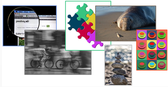
Rule of Thirds
The rule of thirds says that most designs can be made more interesting by dividing the page visually into thirds vertically and/or horizontally and placing our most important elements within those thirds. Take this concept a step further by placing your most important elements at one or more of the four intersections of those dividing lines.
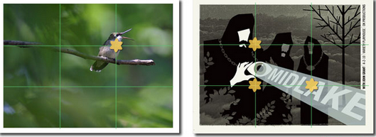
Most designers try to capture the main portion of the subject in the areas of the four main crossroads (as indicated by the yellow stars on the images above). Look at the examples and see how the rule of thirds is utilized in each.
- The hummingbird, which is the primary focus of the photograph, falls perfectly on the rule of thirds grid.
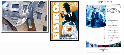
- In the asymmetrical layout, the name MIDLAKE appears in the lower third of the page and runs through an intersection of the rule of thirds. However, the emphasis is on the white face and hand of the largest figure, both of which are close to intersecting point on the rule of thirds grid.
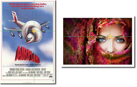
Visual Center
Placing important elements or the focal point of the design within the visual centre of a piece is another design trick. The visual centre is slightly to the right of and above the actual centre of a page.
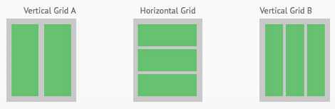
Grids
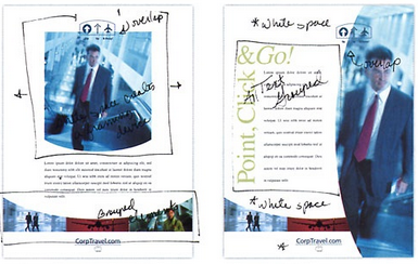
Dividing a page approximately into thirds or finding the visual centre are relatively easy. Usually, you do not have to be exact to achieve your goals. However, constructing the underlying structure of a piece is more complicated -- but it is essential for most designs. Most balanced designs (and even unbalanced ones) rely on a grid. This invisible structure (visible while working in your page layout program) helps ensure that you place all the elements in the right locations to achieve balance and to help with continuity and consistency of design. Grids can be simple or complex depending on the needs of the design and the designer.
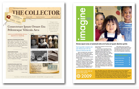
Sometimes the use of a grid is obvious. The asymmetrically balanced design in the following images of newsletters uses a combination of two and three column grids to ensure that each text column is the same width, and it uses graphics, photographs, and colour blocks to help achieve balance as well. In addition, the grid dictates the margins and ensures that the page number and header appear in the same place on each page.
Emphasis
Emphasis is the art of making a specific element stand out. The designer can achieve emphasis by placing elements on the page in
positions where the eye is naturally drawn and by  using
other principles such as contrast, repetition, or movement. Bold and italic type can provide emphasis for text. Size, visual weight, colour, complexity, and uniqueness can provide emphasis for images.
using
other principles such as contrast, repetition, or movement. Bold and italic type can provide emphasis for text. Size, visual weight, colour, complexity, and uniqueness can provide emphasis for images.
Often, this technique is used on opening pages of magazine articles. If the layout grabs the viewers' attention with the dominant visual and introductory copy, viewers will continue reading.
Emphasis by Focal Point
A focal point draws one's attention to the most important element on the page. It is the most visible element (what the designer wants people to see first).
In photography, the focal point usually is found in the foreground.
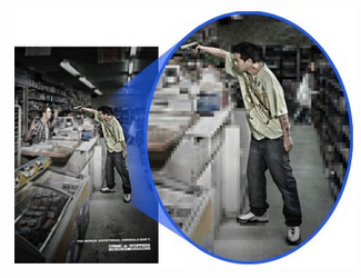
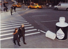
Emphasis by Contrast
Value brings out the differences between a foreground (such as the wolf in the photo below), a mid-ground that may simply support, and a background that may be miles away. Value produces the illusion of form (
depth, height, and width). Value brings objects off the surface and makes them appear real.

Emphasis by Placement
Placing the most important part of an image off-centre or to the left or right and either above or below the centre line adds interest.
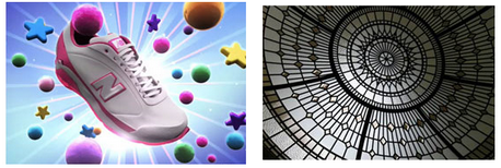
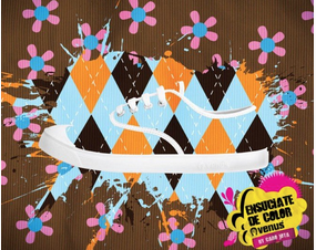
Are you having trouble finding the shoe?
Look for the white laces and sole in the dark brown, orange, and blue harlequin pattern.
Emphasis by Colour
Emphasis by Movement
Designs on an angle or elements that produce the illusion of movement stand out. Consider the examples below. In photography and video, emphasis can imply movement by focusing on a subject that is moving.
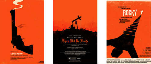
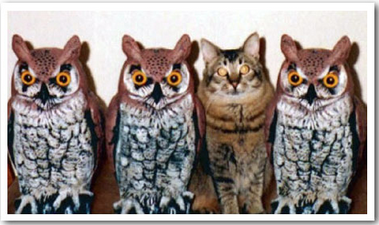
Emphasis by Difference
Designers use colour, shape, line, texture, value, space, and/or form in ways that distinguish one element or area from the whole. We notice things that do not fit into their environment. What doesn't belong in this photograph?
When striving for emphasis ...
Consider the following:
- As an element moves away from the centre of the page, it gains weight.
- An interesting element has more weight than a less-interesting one has.
- An element on the right-hand side of your layout has more weight than the same element on the left-hand side has.
- An element on the top of your layout has more weight than the same element on the bottom has.
- The more you isolate an element, the more weight it has.
- Regular shapes tend to have more weight than irregular shapes have.
Avoid ...
- Placing anything in the centre of your page (on any axis going in any direction, horizontal, vertical, diagonal)
- Placing any element in the centre of any other element
- Placing any element in the corner of the page or in the corner of another element
- Placing any element half on any other element
- Lining up elements on their centre
Proportion

When considering the size relationship of elements in a layout, the designer tries not to have everything the same size. Unequal divisions of space within the layout and elements of various sizes attract attention and elicit interest.
When a page is split horizontally or vertically, the 60/40 or 1/3 to 2/3 proportions are appropriate. Research shows these proportions are appealing to the eye; they reflect the Golden Ratio used in architecture and art since ancient Greek and Roman times.

In the instance of a relationship of size, a comparison is made between
- the height, width, and depth of one element to those of another element
- the size of one area to the size of another area
- the size of one element to the size of another element
- the amount of space between two or more elements
Proportion and Disharmony
Usually, we do not notice proportion until something is different. When the relative size of two elements being compared seems out of balance, they are said to be "out of proportion". Cartoon characters, for example, are often drawn out of proportion with some unduly large feature such as head, ears, or feet.
Bad proportion uses equal division of the shapes, which results in monotony and disharmony. Shapes should fit properly in their positions and spaces.


Sometimes, proportion is exaggerated to convey a message.

Consider the following:
- Place together elements that are similar in character or have some feature in common.
- Designate major and minor areas in the design. (Equal parts can become quickly monotonous and boring.)
- Arrange the space so that the eye does not perceive a standard mathematical relationship.
- Generate harmony by stressing the similarities of all parts.
Avoid ...
- Making size differences so great that the parts appear unrelated and out of harmony
- Dividing the composition in halves, quarters, and thirds
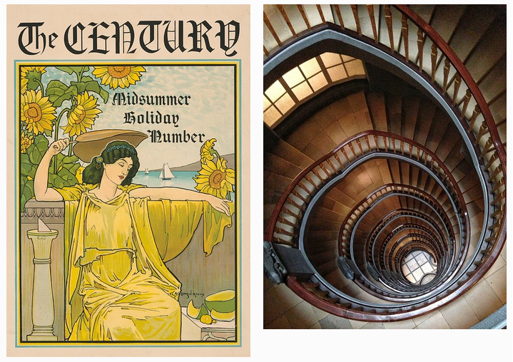
Contrast
Contrast occurs when two related elements are different. The greater the difference, the greater the contrast. Contrast adds variety and promotes unity. It draws the eye into the composition and guides the viewer around the composition.
To create contrast in composition, designers use contrasting colours, sizes, shapes, locations, or relationships. To create contrast in text, we can mix serif and sans-serif fonts, use various font styles, or use fonts in surprising or unusual ways.
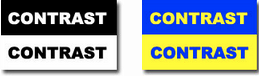
Contrasting Colours
Contrast is the perceived difference between two adjacent colours. Black and white represent the highest level of contrast, but they are not colours. They are said to represent achromatic contrast, which means no colour contrast. Complementary colours (colours directly opposite on the colour wheel) represent high chromatic contrast. Contrasting complementary colours makes them stand out more vibrantly. Notice the high contrast produced by using black/white and blue/yellow.
Warm colours are perceived as advancing out of the screen slightly, but cool colours seem to recede.
Keep the Contrast Simple
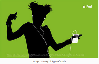
Image courtesy of Apple Canada
Contrasting Text and Backgrounds
|
Developing contrast with text can be as simple as making one word bold or italic so that it will stand out from the remainder of the sentence.
|
 |
On a computer screen, black text on a white background is preferred. It produces the greatest amount of contrast and is best for most readers. |
|
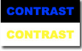
Readability degrades as the level of contrast diminishes, and lettering without sufficient contrast may be hard on the eyes.
Notice how difficult it is to read the black/blue and white/yellow CONTRAST examples.
|
 |
Coloured backgrounds that include patterns and textures also can be problematic.
Contrast with Size
Large and small elements of the same category, such as large and small images and large and small type, are the most obvious uses of size to produce contrast.
As contrast in size diminishes, the effect of the contrast decreases.
Movement
The illusion of movement results from apparent instability in the image.
Techniques to achieve this illusion include the following:
- Adding a blurred background to the image
- Directing the eye in a certain direction (with arrows that point the way or a series of lines or dots that become progressively larger or smaller)
- Using an image of something moving as opposed to something stationary
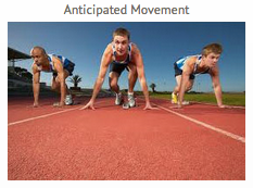
Anticipated and Blurry Movement
Live figures portrayed in unstable body positions cause the viewer to feel that motion is imminent. This heightens the feeling of motion.
 |
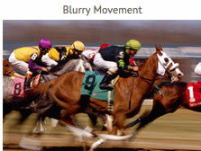 |
When a figure moves past us at very high speeds, we perceive that figure as somewhat blurry. We interpret blurry or indistinct outlines as conveying motion. Automobile manufacturers use this technique in still photos to imply the speed of their cars.
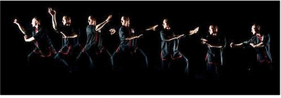
Multiple Images
Showing multiple overlapping images gives the impression of motion. We can see that the person or figure has moved through a series of poses.
Optical Movement
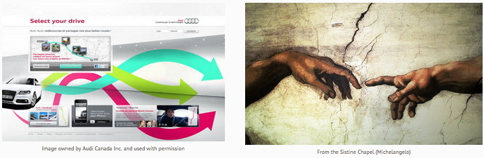
| In optical movement, the eye is forced around the picture to see all the various elements. Optical movement can be enhanced by curved forms that keep the eyes moving in a circular pattern throughout the picture, as in this circular flow chart. Counting from one to nine and the progression of colour through the rainbow generates optical movement. The Audi image uses arrows to move the viewer's attention from left to right. |
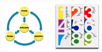 |
circular pattern throughout the picture, as in this circular flow chart.
Counting from one to nine and the progression of colour through the rainbow generates optical movement.
The Audi image uses arrows to move the viewer's attention from left to right.
Michelangelo's reaching fingers illustrate movement and direction.
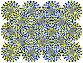
Optical Illusions
For some fun optical illusions and the explanation of why we interpret them the way we do, visit LotoLab.
 |
 |
Rhythm and Movement
Rhythm refers to the way our eyes move throughout a picture. Some pictures move the viewer throughout in a connected, flowing way, much like a slow, stately rhythm in music. Other
pictures move the viewer from one place to another in abrupt, dynamic ways, much like fast, staccato rhythm in music. This gives the impression of movement.
The key to establishing rhythm in design is to understand the difference between repetition and variation.
- Repetition occurs when visual elements are repeated with consistency.
- Variation occurs when aspects of the visual elements in the design change. For example, the designer might change the size, colour, shape, spacing, position, or visual weight.
Rhythm is produced when elements in a composition are repeated. Related or flowing circular elements give a connected and flowing rhythm to a picture. Unrelated or jagged elements result in a more unsettling but dynamic picture.
Repetition establishes rhythm when visual elements are repeated more or less consistently. Variation establishes rhythm when changes are made in the comparative sizes, shape, or quantities of visual elements. Repetition without variation can become boring. Consider the arrows in the Audi advertisement again. They are far more effective at implying movement than they would be if they were identical arrows repeated three times.
Unity
Unity in a composition is achieved when all design principles (balance, emphasis, proportion, contrast, and movement) have been applied
appropriately and harmony occurs among them. Unity is the hallmark of good design because aspects of the design complement one another rather than compete.
Everything you select for use in a composition must complement the key theme, and all parts must serve some functional purposes within the design.
For a composition to have a cohesive look, elements should relate to each other.
Otherwise, the design falls apart.
| Unity serves to reinforce the relationship among the design elements, and it relates them to the key theme expressed. Too often, unity is overlooked; yet, it should be one of the most important design considerations. For a composition to have a cohesive look, elements should relate to each other. Otherwise, the design falls apart. |
 |
Unity produces a sense of order. The effective design has consistent sizes and shapes as well as a harmony of colour and pattern.
When striving to achieve unity ...
Consider the following:
- Repeat the key elements.
- Balance the key elements throughout the composition.
- Add some variety so that the design has its own sense of personality.
Learning to juggle the elements and principles to achieve the right mix is a key to good design.
 |
You'll know you've achieved unity when
|
|
Always have a clear objective in mind, and stay focused on that objective. If there is an element you are considering adding to a composition, determine what it contributes to the general objective. Sometimes, it should not be added to the design. Be analytical about your work and maintain objectivity at all times. Be willing to accept critiques from peers, friends, and family members. When the purpose and message you intend is understood consistently by several people, you have succeeded in using the principle of unity. The relationship of all elements should be so strong that to add or remove any one thing would hurt the design. |
 |
Consider the following:
- Group objects closely together to make them appear as if they belong together. (This allows viewers to see a pattern.)
- Apply the principles of design as the mood and/or purpose of the design dictates. (One design may be strong in balance, for example.)
Do not attempt to apply the principles equally.
- Include as much of each principle as you can into each design.
- Always add something of your own personality into your designs. (This adds character to your work.)
- Dare to violate one or more of the principles of design to promote growth in your creativity. (Experiment!)
Summary
There are many different principles of design and they alter the effectiveness of a picture.
Check out the infographic below for a summary:
