Typography
| Site: | MoodleHUB.ca 🍁 |
| Course: | Introduction to Online Learning |
| Book: | Typography |
| Printed by: | Guest user |
| Date: | Wednesday, 3 December 2025, 4:03 PM |
Typography
Typography is the art and technique of arranging type to make written language readable and appealing. Watch the following videos to learn more about typography.
![]() Typography Terminology
Typography Terminology
Can you spot the following terms in the picture below?
Cap height/Capline, ascender/topline, midline, baseline, descender/beardline, bowl, counter, serif.

Letter Forms
We use both printed and electronic (or digital) type to communicate. Letterforms are an integral part of electronic and printed communication.
Over the years, a nomenclature has evolved that identifies the various components of individual letterforms. By learning this vocabulary, designers and typographers develop a greater understanding of and sensitivity to the visual harmony and complexity of the alphabet.
In medieval times, horizontal guidelines were drawn to contain and align each line of lettering. Today, letterforms and their parts are drawn on imaginary guidelines to bring uniformity to typography.
Review the illustration below and identify the terms associated with lines of type.
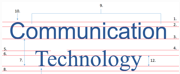
| 1. Cap line (sans serif cap) 2. Mean line (Waistline) 3. Baseline 4. Ascender line |
5. Cap line (serif cap) 6. Waistline (Mean line) 7. Leading line space
8. Descender line
|
9. Lowercase letters |
Sizing & Spacing
Typeface must be sized and spaced reasonably to be read easily.
Typeface size usually reflects the height of the lines of the type, but the inner dimensions of the letters have the greatest effect on readability. For this reason, we should select the type based on appearance and not purely on size.
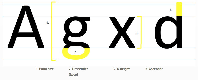
Typeface size (the distance from the ascender line to the descender line),
is measured in points. When the size of lowercase letters
(the x-height, 3. above), is larger than the ascender
height (4. above), more legible words fit into an equivalent space. The sizes of the five fonts shown in blue below
are all 18 points. Yet, word length and readability change with each typeface.
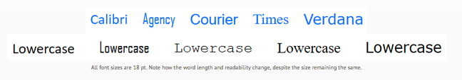
All font sizes are 18 pt. Note how the word length and readability change, despite the size remaining the same.
|
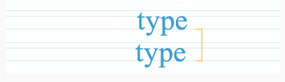
Leading (rhymes with bedding) is the vertical spacing between separate lines of type (the distance from baseline to baseline). Longer lines require more leading to prevent the reader's eye from slipping up or down when moving from the end of one line to the beginning of the next. Then, logically, short lines are preferable if information density is important, as in a newspaper. |
 |
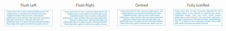
Readability
Readability refers to the way in which words and blocks of type are arranged on a page. Legibility refers to how a typeface is designed and how well one individual character can be distinguished from another.
A designer must choose a typeface that is not only appropriate to the mood of the design but that is appropriate for the purpose of the text in the design. Standard graphic design wisdom holds that serif fonts are easier to read than are sans serif fonts. When reading, the eye quickly scans the tops of the letterforms, and a serif font has more features immediately recognizable thanks to the tiny eye-holds provided by the serifs.

Sans serif and serif uppercase letters (A serif is circled in red)
For the purposes of purely electronic design, sans serif fonts are more readable because a screen has a lower resolution than a printed page has. Serifs serve only to smudge the letterforms. As screen resolution improves and technology improves, both are used more commonly, depending on the application.
Maximum Readability


Line
Words are joined to form verbal sentences and typographic lines. The configuration and placement of lines of type are significant structural concerns. In its most basic form, a line of type consists of a single weight and point size, extended horizontally for a specific line width.
Lines of type can be arranged symmetrically or asymmetrically. The reader must sense a clearly established relationship between individual lines of type and the surrounding space.
White Space
White space (also called negative space), refers to any space free of text. It acts as subtle and invisible punctuation that enables us to read more easily the text on a page and understand the meaning of that text. ![]()
White space enables objects in it to exist. It reduces the amount of text we see at one time. The balance between negative and positive space, the use of white space, is key to aesthetic visual composition. When we discuss the white space between characters, words, and lines of words, we use the terms kerning, tracking, and leading rather than white space.
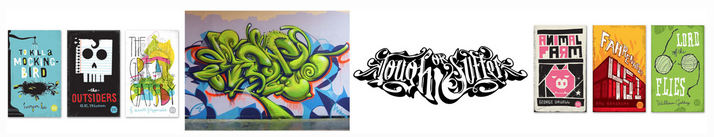
Decorative Type
Text can have several purposes in a design. Variations in text can be used for pure graphic appeal. Sometimes, readability may be less important than aesthetics. Examples of using text for graphical appeal include the use of text in titles, logos, and trademarks.
Many decorative typefaces are poor choices for the main body of an article because a purely decorative typeface distracts from the content of the message and tires the reader's eyes when it is over-used. Our eyes are most comfortable reading less distinctive typefaces.
Decorative typefaces (larger than 14 points) are well suited for display type. Simpler typefaces (smaller than 14 points) are well used for text. To maintain readability in large blocks of text, the writer should stay consistent and use only one typeface family.
Choosing Display Typography
A typeface may be used either successfully or poorly depending on its degree of relevance in the project and the skill of the designer. The designer must give careful attention to letter, word, and line spacing as well as size of the typeface and its stylistic contribution to the aesthetic feel of the project. The designer must optimize the properties of the text so that its purpose in the design (aesthetic or communicative) is served and legibility is maintained where necessary. The designer is expected to add visual variety with formatting, layout, and typeface changes (if applicable).
![]()
Layout Basics
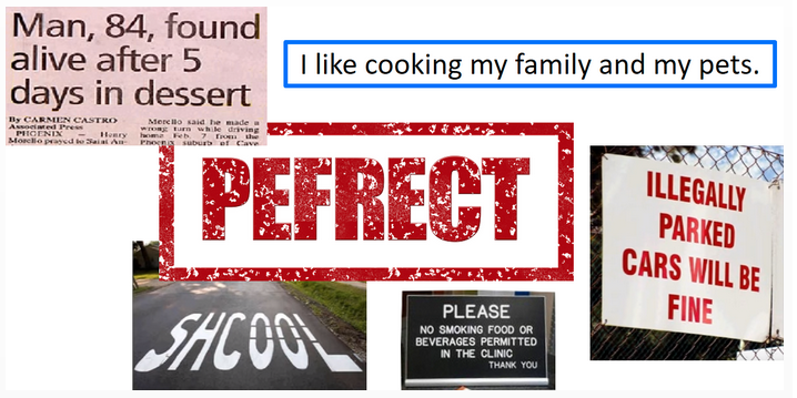
Weak typography is everywhere. Spend a few minutes looking, and you'll find errors in spelling, punctuation, grammar, and composition as well as ineffective layouts and formats (such as those that include poor kerning, and inadequate leading).
Technology is a major barrier to effective typography. For example, a computer keyboard is too small to have separate keys for hyphen, em-dash, and en-dash or for separate open and closed, single and double quotation marks. Designers rely on keyboard shortcuts to find the characters they need, often searching through PopChar on the Mac or Alt character tables on Windows.
Pay attention to the details! Proofread and spell-check rigorously!
Text Layout
Typeface and type size
Begin with the same typeface and type size. Add others as needed.


Page Layout
Page layout is the part of graphic design that deals with the arrangement of elements on a page. An effective layout shows skillful use of the elements and principles of design. Type usually is integrated with other visual elements such as photographs, illustrations, graphs, and graphics. The relationship between type and visuals is affected by page layout. Designers often use grids as the basis for their page layouts.
![]()
Assignment: Unit 4 Project
Unit 4 Project
Online Safety
Click HERE for a printable version of the unit 4 project.
Create a power point or prezi on the topic of online safety. It is up to you to choose the direction that you go with this. (Examples of topics may include: privacy and identity theft, online predators, cyberbullying, online reputation, online dating, radicalization, etc.) Include information about your chosen topic, and relevant visuals to enhance the information that you present.
Investigate the what, when, where and how of your topic (eg. How to recognize, how to prevent, how to respond).
Within your presentation, demonstrate the following:
- Elements of design (line, shape, form, space, value, colour, texture)
- Principles of design (balance, emphasis, proportion, contrast, movement,
unity)
- Typography (sizing, spacing, line, white space, decorative type)
Presentation length: 5 - 10 slides on your topic, plus include a final slide where you clearly outline what aspects of the elements and principles of design and typography you have demonstrated on each slide. (Refer back to unit 4.) Do not just list them, but rather provide detail about how you illustrated each one (see example below).
Eg. Slide 1: Used two different font types (Arial on the
title, sans serif in the text paragraph), and varied text size. Colour changes in font are evident. Image shows balance, symmetry and space in
the display of the road leading into the mountains. Contrast is illustrated in the black image
over the pink background.
*You will have an entry like this one on your last slide, for each slide in
your project.
(Therefore the minimum length of your presentation is 6 slides and the maximum is 11 slides).
Be creative. Include topic related visuals, images, charts etc.
Include interesting facts.
Include a bibliography. You must make sure that you cite all of your resources at the end of the project. Minimum of three sources is required.
Presentation formats may include:
Prezi Presentation – If you use this format, copy your completed project link into a word document and submit the word document into the assignment folder. Note: It must be the “shared link”, or your teacher will not be about to open your prezi.
Power point or google slides
Contact your teacher to approve an alternative tool that is not listed here.
Rubric:
Use the Project Rubric to help guide your project. Make sure that you have addressed all of the required project details outlined above.
When you have finished your project, add it to the Unit 4 project assignment folder. Label your project as follows: U4Project(your surname). Eg. U4ProjectBauer