Lesson 2
1. Lesson 2
1.1. Explore
Module 4: Statistical Reasoning
Explore
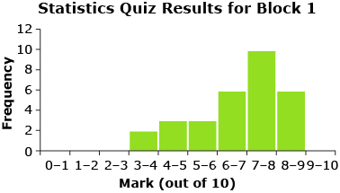
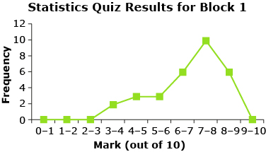
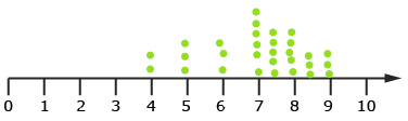
Think back to your discussions in Lesson 1. How was the quiz data organized? Were frequency tables, histograms, frequency polygons, line plots, or other types of tables or graphs used to organize and visualize the data? The following shows quiz data from Mr. Kong’s Block 1 class that you were introduced to in Lesson 1.
|
Statistics Quiz Results Block 1 |
|
|
Mark |
Frequency |
|
0–1 |
0 |
|
1–2 |
0 |
|
2–3 |
0 |
|
3–4 |
2 |
|
4–5 |
3 |
|
5–6 |
3 |
|
6–7 |
6 |
|
7–8 |
10 |
|
8–9 |
6 |
|
9–10 |
0 |
![]()
In this resource and in your textbook, the upper limit of each interval in a frequency table includes that number. For example, in the statistic quiz results for Mr. Kong’s Block 1 class, a score of 4 out of 10 is included in the mark interval 3–4.
frequency table: table listing each item in a set and the number of times each item occurs
A frequency table is also sometimes called a frequency distribution.
histogram: a graph consisting of bars used to visually represent a frequency table where at least one of the scales represents continuous data
The width of a bar represents a class interval and the height of a bar represents the frequency of data in the interval.
frequency polygon: a graph used to visually represent a frequency table where at least one of the scales represents continuous data
A frequency polygon is produced by joining the midpoints of the tops of the bars in a histogram. The ends of the polygon are joined to the horizontal axis at the appropriate end of each interval.
line plot: a graph that records each data value in a data set as a point above a number line
frequency distribution: a set of intervals (graph or table), usually of equal width, into which raw data is organized
Each interval is associated with a frequency that indicates the number of measurements in this interval.
—From CANAVAN-MCGRATH ET AL. Principles of Mathematics 11, © 2012 Nelson Education Limited. Reproduced by permission.
For specific information on different frequency distributions that can be used to display data, refer to “In Summary” on page 248 of your textbook. You may find it helpful to add some of these points to your notes organizer.
If you would like to see more examples of how visual displays can be used to present and compare data, read “Example 1: Creating a frequency distribution” on pages 242 to 245 of your textbook. You may also find it helpful to read “Example 2: Comparing data using histograms” on pages 246 and 247 of your textbook.
When dealing with a large amount of data, one strategy is to use a spreadsheet program to organize and summarize the data. For example, when completing the activity in Lesson 1, Jamila and her group decided to use a spreadsheet to organize and summarize Mr. Kong’s quiz marks. Use the interactive animation Frequency Distribution to help Jamila’s group organize the statistic quiz marks for Mr. Kong’s Block 1 class using a spreadsheet program.
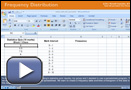
© Microsoft Corporation. All Rights Reserved. Used with permission from Microsoft Corporation.
![]()
The specific keystrokes shown in the animation may be different than the keystrokes you need to use on your calculator. You may need to consult the user manual for your graphing calculator to learn specific instructions. If you are still having problems, contact your teacher.
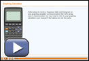
Another strategy is to use graphing technology, such as a graphing calculator, to display the data. Jeff and his group decided to use their graphing calculators to create a frequency table and histogram of the Block 4 data. The following Graphing Calculator animation demonstrates the steps that Jeff’s group used and shows you how to create a frequency table and histogram using your graphing calculator.
Share 1
With a partner, discuss which strategy you prefer for organizing data: the spreadsheet program or the graphing calculator. Can you think of examples where a spreadsheet program may be the best choice? When do you think the graphing calculator may be the best choice?