Typography
| Site: | MoodleHUB.ca 🍁 |
| Course: | COM1005 Learn EveryWare |
| Book: | Typography |
| Printed by: | Guest user |
| Date: | Friday, 26 December 2025, 9:30 AM |
Session 3: Typography
Getting Ready
Typography is the design of individual letters and the arrangement of them in print and/or digital media. For both print and digital media, visual communication professionals must consider fundamental issues of form and structure, design, message, content, and expression.
Letterforms are an integral part of modern communication. Since the invention of the printing press, people have used printed —and more recently— electronic type to communicate. Could you imagine a newspaper or magazine where all the articles were handwritten and copied? Imagine how difficult it would be to compose an e-mail or use desktop publishing software to create party invitations without the existence of typefaces. Prerequisites:There are no prerequisites for this lesson Lesson Outcomes:By the end of Session 3: "Typography", students should be able to:
|

Assessment InformationAs you work through this lesson, you should complete the following assignments:
 Complete the Words Literally Assignment and submit it to the Words Literally Assignment FolderComplete the Monogram Assignment and submit it to the Monogram Assignment Folder Complete the Words Literally Assignment and submit it to the Words Literally Assignment FolderComplete the Monogram Assignment and submit it to the Monogram Assignment Folder More information on these assignments can be found in the "Reflect and Connect" section of this lesson.
|
Session 3: Typography
Parts of Letterform
|
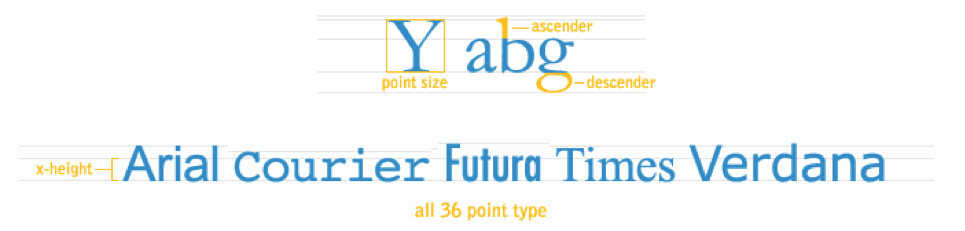
Over the centuries, a nomenclature has evolved that identifies the various components of individual letterforms. By learning this vocabulary, designers and typographers can develop a greater understanding and sensitivity to the visual harmony and complexity of the alphabet.
Using correct nomenclature is vital to communication, especially technical communication. |
|


 Try This:
Session 3: Typography
Classification
|
A tremendous variety of type styles is available today. Digital typography, with its simple and economical ability to create new typefaces. In addition, we have access to the entire array of typefaces developed over the centuries. In the past a typesetter would have to buy a type tray, called a "California Job Case", made of metal or wooden type. The 'type setter' would place each individual letter in the correct order to make a page layout. It was painstaking work. A page of type could take hours and hours to complete to prep for printing. Now you can buy most typefaces online as software for most computers.
Check out this short video on typography: A number of efforts have been made to classify typefaces, with most falling into the following major categories. Serif typefaces, like Times, have the little feet and variable line widths which make them easy to read. Sans serifs typefaces do not have little feet and are more common on websites. There are also decorative, stylized, or novelty classifications for the wide range of fanciful type styles that defy categorization and are usually used to catch the viewer's attention, as in a headline for example, for example.
The style of Roman letter that is most directly descended in form from chisel edge drawn models. The style is characterized by angle and bracketed serifs, biased stress, less thick and thin contrast. Some examples are Caslon, Garamond, Palatino, and Times Roman.
A style of Roman letter that exhibits design characteristics of both modern and old-style faces. For example, Baskerville, Century Schoolbook, and Cheltenham.
A style of Roman letter whose form is determined by mechanical drawing tools rather than a chisel-edged pen. This sytle is characterized by extreme thick and thin contrast, vertical/horizontal stress, and straight on, bracketed serifs. For example, Bodini, Caledonia, and Tiffany.
Also known as Slab Serif is a style of Roman letter characterized by heavy, slab like serifs. The thin strokes are usually fairly heavy. It may have modern or old-style design qualities that are sometimes called square serif or slab serif. For example, Claredon, Egyptian, and ITC Lubalin Graph.
This is a letter form design resembling handwriting with the notes appearing at an angle or slant to the right. This style was originally used as an independent design alternative to Roman. It is now used as a style variant for a typeface in a type family that applies to most serif and sans serif typefaces.
Script is letterform design that most resembles handwriting. Letters usually slant to the right and are joined. Script type can emulate forms written with chisel edge pen, flexible pen, pencil, or brush. For example, Brush Script, Shelley Allegro Script, and Snell Roundhand Script.
Sans serif letter forms are designed without serifs and usually have no discernible thick and thin variations. For example, Futura, Helvetica, and Univers. A typeface is a style of lettering, such as Helvetica or Times. A font is the set of a typeface, used to produce the letters. On a computer, it is a file used by the system. People often confuse "font" with "typeface". For example, Helvetica, point 12 is a different font from Helvetica, point 14, even though both are of the same typeface.
A set of similar typefaces is called a "family." Within a family, typefaces are categorized as parent (e.g. Times, Helvetica) or relative (e.g. bold, italic). Typefaces are categorized also according to style (e.g. italic, book), weight (e.g. bold or light), and width (e.g. expanded). |
|


 Try This:
Session 3: Typography
Decorative Type
|
Text can have a number of different purposes in a design. It can be used for pure graphic appeal, a case in which readability may be less important than aesthetics. An example of the graphical use of text is in titles, logos and trademarks.
Text may also be used for communication of information rather than for visual effect, in which case, legibility is always the priority of the designer. A few examples of usage of text for linguistic communication are: the body text of an article or book, the text of a restaurant menu, or in product descriptions in a catalog.
A typeface may be used either successfully or poorly, depending on its degree of relevance in the project and the skill of the designer. The designer must pay careful attention to letter, word, and line spacing as well as the size of the typeface and its stylistic contribution to the overall aesthetic feel of the project. They must optimize the properties of the text for its purpose in the overall design (aesthetic or communicative) and maintain legibility where it is necessary. The designer is also expected to add visual variety with formatting and layout, as well as possible typeface changes where applicable. |
|
 Try This:
Session 3: Typography
Readability
|
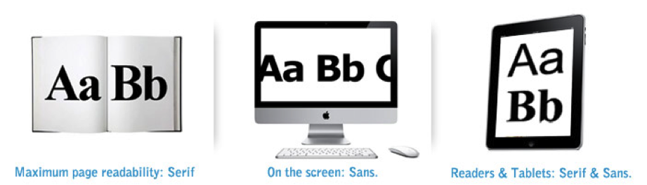
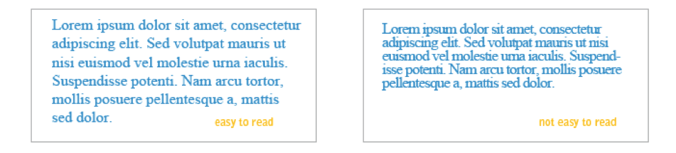
A designer has to choose a typeface that is not only appropriate to the mood of the design, but that is appropriate for the text's purpose in the design. Standard graphic design wisdom holds that of the classifications of serif and sans-serif, serif fonts are easier to read. This is because when reading, the eye quickly scans the tops of the letterforms and a serif font has more immediately recognizable features thanks to the tiny 'eye-holds' provided by the serifs. There is a notion slowly gaining acceptance that for the purposes of purely electronic design, the reverse is sometimes true. Sans-serif fonts are more readable in this case because a screen has a lower resolution than a printed page, so the serifs only serve to smudge the letter forms. As screen resolution improves and technology improves, both are being used more commonly depending on the application.
Some typefaces, such as Times, originally designed for the London Times newspaper, or Futura, designed as a letterpress (raised plate) type for printing on paper, were intended for the printed page. Others such as Georgia and Verdana were designed for the lower resolution of text on a screen. The shapes of these typefaces are developed to optimize visibility in smaller sizes on a computer monitor. In larger sizes, these differences don't matter as much. LineWords are joined to form verbal sentences and typographic lines. The configuration and placement of lines of type are significant structural concerns. In its most basic form, a line of type consists of a single point size and a single weight extended horizontally over a specific line width.
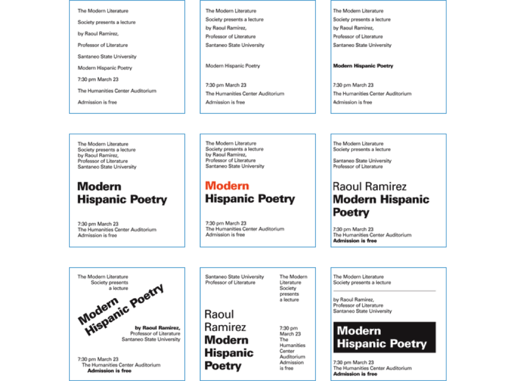
HierarchyA visual hierarchy is an arrangement of elements in a graduated series, from the most prominent to the least prominent, in an area of typographic space. When establishing a visual hierarchy, a designer carefully considers the relative importance of each element in the message, the nature of the reader, the environment where the communication will be read, and the need to create a cohesive arrangement of forms within the typographic space. The study of visual hierarchy is the study of the relationships of each part to the other parts, and the whole. When elements have similar characteristics, they have equality in the visual hierarchy, but when they have contrasting characteristics, their differences enable them to take dominant and subordinate positions in the composition. Here is the same content demonstrating visual hierarchy.
|
|

 Try This:
Session 3: Typography
Typography Details
|
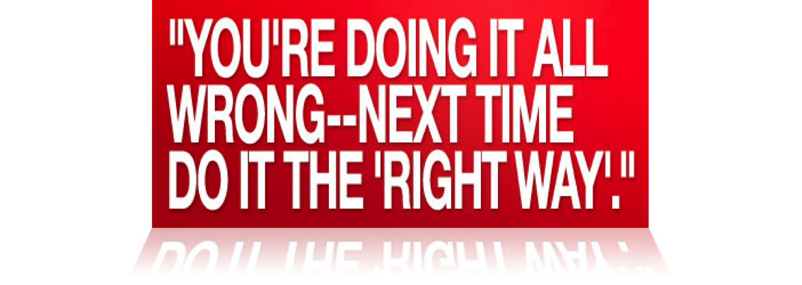
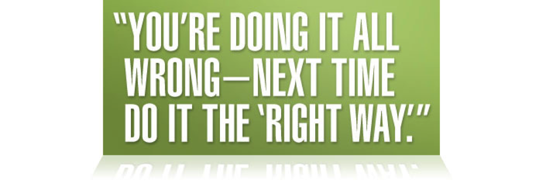
Can you see what’s wrong with the statement above?
Here are some basics to follow when doing text layout to maximize readability and help you from making typographic errors.
|
|
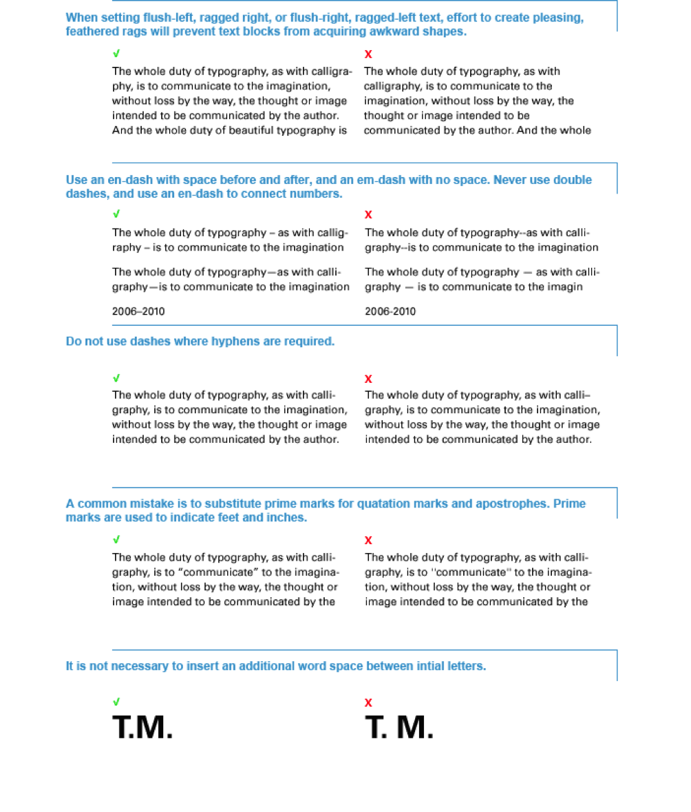
 Try This:
Session 3: Typography
Sizing and Spacing
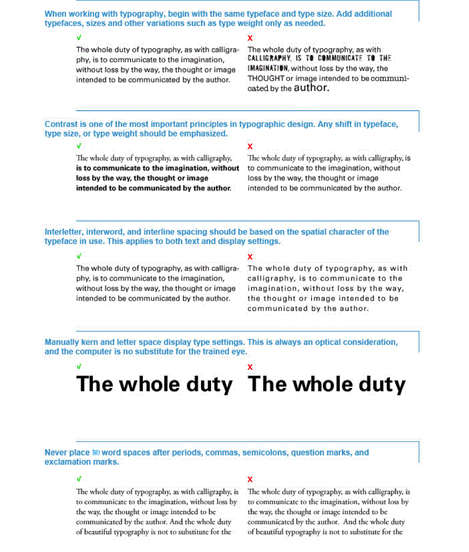
Typeface SizingKeep the typeface at a reasonable size for reading. The numbered size of a typeface may reflect the overall height of the lines that stick out of the type, but not the readability size that relates to the inner dimensions of the letters. The type size should be chosen on a visual basis, and not purely on that of font size numbers. Usually, type that is proportioned so that the lower case size is larger in proportion to the overall height of the font, can produce a greater amount of legible words into an equivalent space.
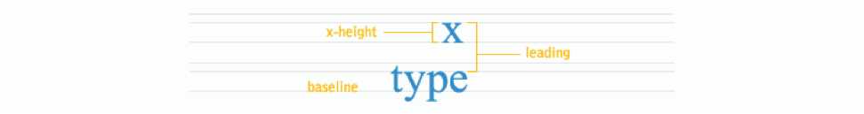
Typeface SpacingWord spacing should be so that the reader is aware of the beginnings and endings of words with little or no difficulty. Experiment with spacing settings to find the best one. Letter spacing and line spacing may be used to expand on the expressivity of the font. Leave enough space between the lines so that the text is legible. Experimentation is important here, too. The reader's eyes should be pulled to the next word as they read, not to the lines above and below. The letter spacing should be that so the reader can easily differentiate between different characters. Experiment, experiment, experiment. KerningKerning is the horizontal spacing between exactly 2 glyphs. When you are hand kerning text (logotype or headline text usually) try to imagine that the baseline and glyph shapes make a container, and imagine pouring water in. Try to make the negative space between each pair of glyphs hold the same amount of water. Click on the image below to try an interactive activity to help you understand kerning:
TrackingTracking is the horizontal space added to or subtracted from the space between each and every pair of glyphs in a selection. In other words, tracking adds to or subtracts from the kerning of all pairs of glyphs in a selection.
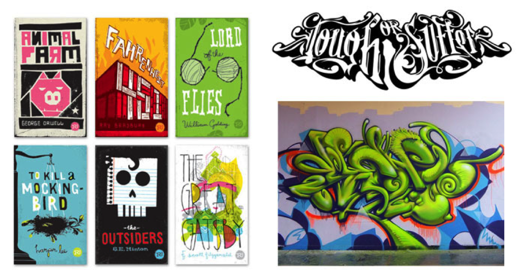
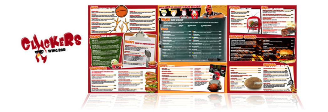
LeadingLeading is the vertical spacing between separate lines of type. There is a relationship between the length of the line and the amount of leading needed for easy legibility. Longer lines need more leading to prevent the reader's eye from slipping up or down when moving from the end of one line to the beginning of the next. It then logically follows that short lines are preferable if information density is important, as in a newspaper. LayoutA good layout is one that shows good use of the elements and principles of design. Most importantly, a designer should use the principles of design to draw the reader's eye both to and through the design easily. To refresh you the elements of design are: color, value, texture, shape, form, space, and line. The principles of design are: contrast, emphasis, balance, unity, pattern, movement, and rhythm. The specifics of both the principles and elements vary from source to source, but the idea remains the same. Type and VisualsType is usually designed with other visual elements, such as photographs, illustrations, graphs, and graphics. The relationship between typed and visuals is crucial, it should be synergistic. When the cooperative action between type and the visuals is created, the design becomes a cohesive unit. In addition to understanding the fundamentals of design and how they relate specifically to designing with type, it is essential to understand how type can be used creatively and expressively. Used in conjunction with the visual, type is often the verbal part of the design message. However type can be the visual itself and can express the entire message. Below are two examples of how type is the main element used to animate a message.
|


Session 3: Typography
Session 3 Evaluation:Assignment #4:Words LiterallyInstructions Choose two words from the list below. In two different compositions, arrange each word to express its meaning (one word per composition). You may use any computer program that you wish to accomplish this task (Microsoft word, Photoshop, pages, etc.). The composition should be 15 cm x 15 cm (6” x 6”) square. You may vary the size, spacing, placement, and orientation of the letters. Use the typeface Futura Bold. You may repeat, omit, slice, block, or overlap words or letters. Do not use drop shadows or horizontal/vertical scaling (distortion). Consider the entire space of the square.
Example
Choose 2 of the following words: transition contraction addition subtraction disruption repetition elimination migration expansion Evaluation
Assignmnet #5: Monogram AssignmentCreate a monogram using a font that you feel represents you. Using Photoshop, or another digital editing software of your choice, create a monogram using your initials. You must use at least 3 different elements and/or principles of design in your monogram. Once you have completed your monogram, describe the elements and principles of design that you used, or considered, when creating your monogram.
Total Marks: 12 (see rubric) Learn more about monograms here: http://en.wikipedia.org/wiki/Monogram Famous Monograms:
Rubric:
If you have any questions about these 2 assignments, please contact your teacher. |


Session 3: Typography
Lesson Summary
|
In this section, students were introduced to the basic principles of typography. Typography is the design of individual letters and the arrangement of them in print and/or digital media. For both print and digital media, visual communication professionals must consider fundamental issues of form and structure, design, message, content, and expression. Students examined how typography can be used when creating compisitions and had the opportunity to create a couple of quick designs using typography. In the next lesson, students will take a look at copyright issues and careers in the graphic design field.
Before continuing on, please review the lesson objectives that were presented to you at the beginning of the lesson. If you have any questions, please contact your teacher before moving on. By the end of Session 3: "Typography", students should be able to:
|
Checking InOnce you have completed the words literally assignment, the monogram assignment and reviewed the lesson objectives above, you may continue onto Session 4. |