Lesson 2
| Site: | MoodleHUB.ca 🍁 |
| Course: | Math 20-2 SS |
| Book: | Lesson 2 |
| Printed by: | Guest user |
| Date: | Tuesday, 30 December 2025, 3:40 AM |
Description
Created by IMSreader
1. Lesson 2
Module 4: Statistical Reasoning
Lesson 2: Using Summary Statistics to Interpret Data
Focus
Digital Vision/Thinkstock
Data can be organized, summarized, and presented in a variety of ways. Each tool and strategy used may highlight or draw attention to different parts of the data. In Lesson 1 you were presented with an example of Mr. Kong’s quiz marks from two different groups of students.
Working with the individual class data sets allows you to compare the two quiz results for the two classes. This strategy allows you to look at both the similarities and the differences in the data for the two classes. Combining the quiz marks for both classes gives you information about student performance on the quiz regardless of which block the quiz was written in. This demonstrates that how data is displayed or organized affects what types of comparisons can be made and what inferences or conclusions can be drawn from the data.
In this lesson you will look at how summary statistics can be used to interpret data and make decisions or solve problems.
This lesson will help you answer the following critical question:
- How can summary statistics be used to solve problems and make decisions?
Assessment
- Lesson 2 Assignment
All assessment items you encounter need to be placed in your course folder. You should have already had a discussion with your teacher about which items you will be handing in for marking. For those items that you will not be handing in for marking, you should have already had a discussion with your teacher about how you can access the solutions to these questions. Make sure to follow your teacher’s instructions.
![]() Save a copy of the Lesson 2 Assignment to your course folder.
Save a copy of the Lesson 2 Assignment to your course folder.
Materials and Equipment
- graphing technology
- ruler
- 1-cm Grid Paper or 2-cm Grid Paper
1.1. Explore
Module 4: Statistical Reasoning
Explore
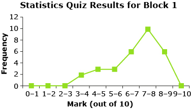
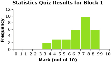
Think back to your discussions in Lesson 1. How was the quiz data organized? Were frequency tables, histograms, frequency polygons, line plots, or other types of tables or graphs used to organize and visualize the data? The following shows quiz data from Mr. Kong’s Block 1 class that you were introduced to in Lesson 1.
|
Statistics Quiz Results Block 1 |
|
|
Mark |
Frequency |
|
0–1 |
0 |
|
1–2 |
0 |
|
2–3 |
0 |
|
3–4 |
2 |
|
4–5 |
3 |
|
5–6 |
3 |
|
6–7 |
6 |
|
7–8 |
10 |
|
8–9 |
6 |
|
9–10 |
0 |

![]()
In this resource and in your textbook, the upper limit of each interval in a frequency table includes that number. For example, in the statistic quiz results for Mr. Kong’s Block 1 class, a score of 4 out of 10 is included in the mark interval 3–4.
frequency table: table listing each item in a set and the number of times each item occurs
A frequency table is also sometimes called a frequency distribution.
histogram: a graph consisting of bars used to visually represent a frequency table where at least one of the scales represents continuous data
The width of a bar represents a class interval and the height of a bar represents the frequency of data in the interval.
frequency polygon: a graph used to visually represent a frequency table where at least one of the scales represents continuous data
A frequency polygon is produced by joining the midpoints of the tops of the bars in a histogram. The ends of the polygon are joined to the horizontal axis at the appropriate end of each interval.
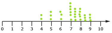
line plot: a graph that records each data value in a data set as a point above a number line
frequency distribution: a set of intervals (graph or table), usually of equal width, into which raw data is organized
Each interval is associated with a frequency that indicates the number of measurements in this interval.
—From CANAVAN-MCGRATH ET AL. Principles of Mathematics 11, © 2012 Nelson Education Limited. Reproduced by permission.
For specific information on different frequency distributions that can be used to display data, refer to “In Summary” on page 248 of your textbook. You may find it helpful to add some of these points to your notes organizer.
If you would like to see more examples of how visual displays can be used to present and compare data, read “Example 1: Creating a frequency distribution” on pages 242 to 245 of your textbook. You may also find it helpful to read “Example 2: Comparing data using histograms” on pages 246 and 247 of your textbook.
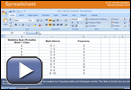
When dealing with a large amount of data, one strategy is to use a spreadsheet program to organize and summarize the data. For example, when completing the activity in Lesson 1, Jamila and her group decided to use a spreadsheet to organize and summarize Mr. Kong’s quiz marks. Use the interactive animation Frequency Distribution to help Jamila’s group organize the statistic quiz marks for Mr. Kong’s Block 1 class using a spreadsheet program.
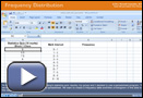
© Microsoft Corporation. All Rights Reserved. Used with permission from Microsoft Corporation.
![]()
The specific keystrokes shown in the animation may be different than the keystrokes you need to use on your calculator. You may need to consult the user manual for your graphing calculator to learn specific instructions. If you are still having problems, contact your teacher.
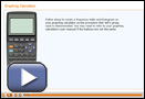
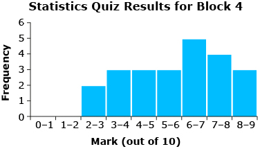
Another strategy is to use graphing technology, such as a graphing calculator, to display the data. Jeff and his group decided to use their graphing calculators to create a frequency table and histogram of the Block 4 data. The following Graphing Calculator animation demonstrates the steps that Jeff’s group used and shows you how to create a frequency table and histogram using your graphing calculator.
Share 1
With a partner, discuss which strategy you prefer for organizing data: the spreadsheet program or the graphing calculator. Can you think of examples where a spreadsheet program may be the best choice? When do you think the graphing calculator may be the best choice?
1.2. Explore 2
Module 4: Statistical Reasoning
measures of central tendency: numbers that indicate the centre of a set of ordered numerical data
The three common measures of central tendency are the mean, the median, and the mode.
dispersion: a measure that varies by the spread among the data in a set
Dispersion has a value of zero if all the data in a set is identical. Dispersion increases in value as the data becomes more spread out. In other words, the greater the range in a data set, the higher the dispersion values.
— From CANAVAN-MCGRATH ET AL. Principles of Mathematics 11, © 2012 Nelson Education Limited. Reproduced by permission.
Visual displays of data are useful because they quickly reveal information about the data set. Another way to meaningfully describe a set of data is to use a summary statistic. For instance, you and your group may have used measures of central tendency to summarize the quiz marks. You might have calculated the mean, median, and mode of the data sets. Or you may have calculated measures of dispersion, such as range.
Each one of these summary statistics is a tool that provides specific information about the data. This information can be very useful for comparing sets of data.
For instance, summary statistics for Mr. Kong’s statistics quiz show the following:
- The Block 1 class had a higher mean.
- The most common score in both classes was 7 out of 10.
- The spread of marks (i.e., range) was greater in Block 4 than in Block 1.
|
Statistics Quiz Block 1 |
|
|
number of quizzes |
30 |
|
mean |
7.1 |
|
mode |
7 |
|
median |
7.5 |
|
range |
5 |
|
Statistics Quiz Block 4 |
|
|
number of quizzes |
25 |
|
mean |
6.5 |
|
mode |
7 |
|
median |
7 |
|
range |
6.5 |
![]()
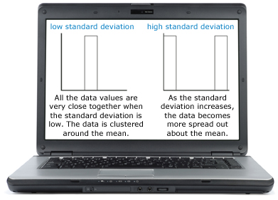
Another measure of dispersion is standard deviation. Standard deviation gives information on the spread or the amount of dispersion in the data set. Basically, it shows how much dispersion or variation there is from the mean (i.e., average). The standard deviation can be low or high depending on how spread out the data is.
Try This 1
You should place your completed Try This activities in your course folder. Your teacher may ask to see your completed Try This activities. For more information on Try This activities, refer to the Course Introduction.
Use the applet Standard Deviation to determine what happens to data distribution as you increase the standard deviation.
1.3. Explore 3
Module 4: Statistical Reasoning
The larger the standard deviation, the more spread out the data is—more data is further from the mean. The lower the standard deviation, the more clustered the data is about the mean—more data is close to the mean.
Standard deviation is another tool that provides information that you can use to draw inferences from numerical data and compare two or more data sets.
Outliers (one or two numbers in the data that are much larger or smaller than most of the data) can significantly affect all summary statistics for a set of data. If your data set has an outlier, the measure of central tendency most affected is the mean. Both measures of dispersion, the range and standard deviation, are also affected by an outlier. If you are using range and/or standard deviation as part of summary statistics, the outlier should be removed before performing the calculation.
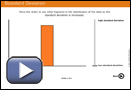
Take a look at the quiz results from Mr. Kong’s two classes. Consider the following questions:
- Just by looking at the histograms for each block, can you tell which set of data would have the higher standard deviation? How do you know?
- Is this consistent with what you would expect, given the result for the other measure of dispersion (range)?
|
Statistics Quiz Block 1 |
|
|
number of quizzes |
30 |
|
mean |
7.1 |
|
mode |
7 |
|
median |
7.5 |
|
range |
5 |
|
Statistics Quiz Block 4 |
|
|
number of quizzes |
25 |
|
mean |
6.5 |
|
mode |
7 |
|
median |
7 |
|
range |
6.5 |
The histograms show that the data for Block 4 is more dispersed or spread out about the mean than the data for Block 1. Therefore, Block 4 has a higher standard deviation than Block 1. This makes sense since the range for the quiz marks in Block 4 is larger than the range of marks for Block 1.
1.4. Explore 4
Module 4: Statistical Reasoning
Standard deviation, just like the other summary statistics, can be calculated manually or by using technology. Note that for Mathematics 20-2, you are not expected to determine mean and standard deviation manually.
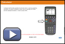
Use the interactive animation titled Spreadsheet to help Jamila’s group use a spreadsheet program to calculate measures of central tendency and dispersion for the statistic quiz marks for Mr. Kong’s Block 1 and Block 4 classes.
© Microsoft Corporation. All Rights Reserved. Used with permission from Microsoft Corporation.
A graphing calculator can also be used to calculate mean and standard deviation. Remember that the symbol for mean is ![]() and the symbol for standard deviation is σ.
and the symbol for standard deviation is σ.
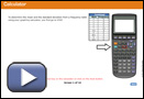
Use the interactive animation Calculator to help Jeff’s group calculate the mean and standard deviation for the statistic quiz marks for Mr. Kong’s Block 4 class.
Jeff entered all of the values in his data set into list 1 in his calculator. Mean and standard deviation can also be determined with graphing technology from a frequency table.
Use the animation Combined Calculations to determine the mean and standard deviation of the combined quiz marks for Block 1 and Block 4 using a graphing calculator.
© Microsoft Corporation. All Rights Reserved. Used with permission from Microsoft Corporation.
The keystrokes required to determine the mean and standard deviation on your calculator may be different than those shown in the previous animations. Consult the user manual for your graphing calculator for specific instructions. If you are still having problems obtaining the correct values, contact your teacher.
Sometimes, an entire class may not do well and the mean (class average) is very low—it may even be less than 50%. When this happens, some teachers will adjust all of the class marks by adding 5% to each student’s mark. What effect does this have on the mean and the standard deviation?
Try This 2
Use Adjusting Marks to compare the mean and standard deviation of different data sets.
Hemera/Thinkstock
1.5. Explore 5
1.6. Explore 6
Module 4: Statistical Reasoning

iStockphoto/Thinkstock
Standard deviation is also used as a measure of consistency. This tells us whether the process used to generate the data is consistent. When the standard deviation is low (i.e., the data is closely clustered around the mean), the process used to generate the data can be thought of as being more consistent than a process that generated data with a high standard deviation (i.e., the data is more spread out around the mean).
For example, a company that makes lids for coffee cups may take a sample of 100 lids and measure them. If the standard deviation is low—in other words, the lids are all very close to the same size—then the process used to make the lids is consistent. However, if the standard deviation is high—the size of the lids is very different—then the process used to make the lids is not consistent. It is certain that the stores that buy the lids want to know that the process to make the lids is consistent.
The calculation of standard deviation is an important part of summarizing and interpreting data.
Read “Example 1: Using standard deviation to compare sets of data” on pages 256 and 257 of your textbook. How can range and standard deviation be used by companies for quality control?
As you have been progressing through each lesson, you have been adding to your notes organizer. Remember to update your notes organizer with any new information you have learned in this lesson.
Add any new terms you come across to your Glossary Terms document. You can either add terms to your existing Glossary Terms document in your course folder or you can open a Glossary Terms document and start a new list for this module. You can also go to Mathematics Glossary to find more information, including examples, for the terms presented in this lesson.
At this point, you may find it helpful to refer to “In Summary” on page 260 of your textbook.
Self-Check 2
1.7. Connect
Module 4: Statistical Reasoning
Connect
Lesson Assignment
Complete the Lesson 2 Assignment that you saved to your course folder.
Going Beyond
If you would like to see how mean and standard deviation are calculated manually, look at “Example 2: Determining the mean and standard deviation of grouped data” on pages 257 and 258 of your textbook.
Remember that this is not part of the Mathematics 20-2 course, and you will not be assessed on this.
1.8. Lesson 2 Summary
Module 4: Statistical Reasoning
Lesson 2 Summary
Data can be organized, presented, and summarized in a variety of ways. How data is displayed or organized affects what inferences or conclusions can be drawn from the data. Summary statistics, such as measures of central tendency and/or measures of dispersion, can meaningfully describe a set of data.
When interpreting data, sometimes more than just the mean, median, and mode are required. Measures of dispersion, like range and standard deviation, are useful because they can be used to determine how scattered or clustered a data set is.
iStockphoto/Thinkstock
When the standard deviation is low and the data is clustered around the mean, the process used to generate the data is considered more consistent than a process that generated data with a high standard deviation (data more spread out about the mean).
This information is useful in comparing data as well as in interpreting the data to make decisions or solve problems.
In Lesson 3 you will continue to look at how standard deviation can be used to help make decisions or solve problems.