Lesson 3
| Site: | MoodleHUB.ca 🍁 |
| Course: | Math 20-2 SS |
| Book: | Lesson 3 |
| Printed by: | Guest user |
| Date: | Tuesday, 30 December 2025, 3:41 AM |
Description
Created by IMSreader
1. Lesson 3
Module 4: Statistical Reasoning
Lesson 3: The Normal Distribution
Focus
Most high schools have a set amount of time in between classes in which students must get to their next class. If you were to stand at the door of your statistics class and watch the students coming in, think about how the students would enter. Usually, one or two students enter early, then more students come in, then a large group of students enter, and then the number of students entering decreases again, with one or two students barely making it on time, or perhaps even coming in late! Try the same by watching students enter your school cafeteria at lunchtime. Spend some time in a fast food restaurant or café before, during, and after the lunch hour and you will most likely observe similar behavior.
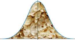
Have you ever popped popcorn in a microwave? Think about what happens in terms of the rate at which the kernels pop. Better yet, actually do it and listen to what happens! For the first few minutes nothing happens, then after a while a few kernels start popping. This rate increases to the point at which you hear most of the kernels popping and then it gradually decreases again until just a kernel or two pops. Try measuring the height, or shoe size, or the width of the hands of the students in your class. In most situations, you will probably find that there are a couple of students with very low measurements and a couple with very high measurements with the majority of students centered around a particular value.
c CK Foundation, Creative Commons Attribution-NonCommercial-ShareAlike 3.0 Unported License
These two examples show a typical pattern that seems to be a part of many real life phenomena. In statistics, because this pattern is so pervasive, it seems fit to call it “normal,” or more formally the normal distribution. The normal distribution is an extremely important concept because it occurs so often in the data we collect from the natural world, as well as many of the more theoretical ideas that are the foundation of statistics.
—c CK Foundation, Creative Commons Attribution-NonCommercial-ShareAlike 3.0 Unported License
This lesson will help you answer the following critical question:
- How can the properties of a distribution of data be used to compare data and make decisions?
Assessment
- Lesson 3 Assignment
All assessment items you encounter need to be placed in your course folder.
![]() Save a copy of the Lesson 3 Assignment to your course folder.
Save a copy of the Lesson 3 Assignment to your course folder.
Materials and Equipment
- calculator
- ruler
- 1-cm Grid Paper or 2-cm Grid Paper
1.1. Discover
Module 4: Statistical Reasoning
Discover
Have you ever noticed how graphs of data can have different shapes? For instance, the frequency distributions for Mr. Kong’s Block 1 and Block 4 quiz marks have different shapes.
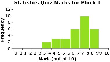
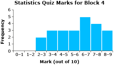
Each one of the graphs for the quiz marks has only one peak.
Take a look at the shapes of the following graphs and consider this question: What information can the shape of the graph provide about the data? Think about what the number of peaks tells you about the data.
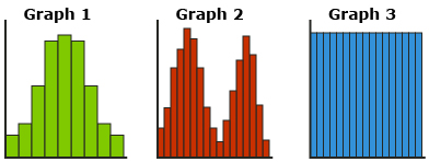
Here is some information you might determine based on the shape of the graph.
- One peak means there is one mode (i.e., unimodal, one number that occurs most frequently). The data looks like it is symmetrical about the peak (half the data is above the peak and half the data is below the peak).
- Two peaks means there are two modes (i.e., bimodal, two numbers that occur most frequently).
- No peaks means there are no modes (i.e., all the numbers occur with the same frequency).
Frequency distributions (i.e., graphs) help to visualize and summarize data. Graphs are also useful to help determine if data approximates a normal distribution.
normal distribution: data that produces a graph that is unimodal (has one mode) and symmetrical about the mean
The mean, median, and mode of a normal distribution are equal (or close) and fall at the line of symmetry.
— From CANAVAN-MCGRATH ET AL. Principles of Mathematics 11, © 2012 Nelson Education Limited. Reproduced by permission.
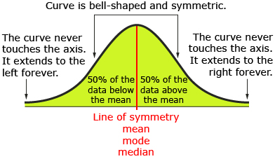
normal curve (bell curve): symmetrical curve with a central peak at the mean of the data
A normal distribution of data has a graph that is shaped like a bell. There is one mode (i.e., peak) and the data is symmetrically distributed about the mean. In other words, there is the same amount of data above the mean as below the mean. Most values are near the middle or mean of the graph with very few values near the upper and lower extremes of the graph. The graph of a normal distribution is called a normal curve or a bell curve because of its shape.
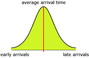
The normal curve arises because the outcomes of random situations will frequently be clustered around the mean with only a few outcomes far away from the mean. Again, consider students arriving for class. Most of the students arrive for class at about the same time. The further you are from the average time, the fewer students are arriving.
Now, this frequency distribution might not be true if your data is for only a few people in your class. But what if you had the class arrival times for the entire population of high school students in Canada or the world? Do you think that data will better approximate a normal distribution if the number of data values increased?
1.2. Discover 2
Module 4: Statistical Reasoning
Try This 1
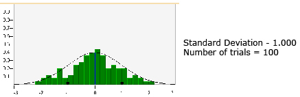
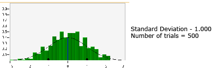
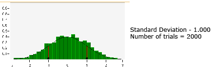
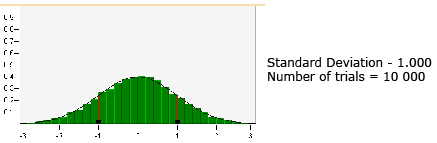
Use the interactive applet “Normal Distribution” to investigate how increasing the number of trials affects the shape of a frequency distribution. As you progress through this applet, you will also change the standard deviation to see how changing the standard deviation changes the shape of the graph.

© Shodor Education Foundation Inc.
The graph (i.e., the black, bell-shaped curve) in the applet shows a normal curve. The mean is indicated by a blue line, and the standard deviation is indicated by a red line on either side of the mean. You will notice that the frequency is given on the y-axis. Your textbook replaces these values with the word frequency. You will find that it is much easier to sketch a normal curve if you put the frequency scale on the y-axis.
Use the following instructions to experiment with different numbers of trials and standard deviations.
Step 1: Set the bin size to 0.2 by moving the slider to the appropriate position.
Step 2: Enter a standard deviation of 1 into the “New Standard Deviation” box and select “Set.”
Step 3: In the “Histogram” section, use the drop-down menu and select 100 trials. Then choose the “Create new Histogram with” button. Make sure the “Draw Histogram” box is checked. You should click the button at least five times. Notice how the shape of the histogram changes each time.
Step 4: Repeat step 3 with 500, 1000, 2000, 5000, and 10 000 trials. Answer the following question, and place your answer in your course folder.
How does the shape of the graph change as the number of trials is increased?
Step 5: Repeat steps 3 and 4 with standard deviations of 0.5 and 1.25. Remember to click “Set” after you enter the new standard deviation. Answer the following questions, and place your answers in your course folder.
- How does the shape of the graph change when the standard deviation is decreased (e.g., from 1 to 0.5)?
- How does the shape of the graph change when the standard deviation is increased (e.g., from 0.5 to 1.25)?
Step 6: You can drag the black dots on the standard deviation lines or enter new standard deviations to experiment with the shape of the graph with other standard deviations. Note that the maximum standard deviation you can enter is 1.25 and the minimum standard deviation is 0.41.
1.3. Explore
Module 4: Statistical Reasoning
Explore
It is important to realize that there is no perfect normal distribution. Normal distribution is a mathematical ideal. However, you can be more confident that data approximates a normal distribution with the more data you have or the more trials that are performed.
Did you notice in the “Normal Distribution” applet in Try This 1 how the histograms approximated the normal distribution (i.e., approached the normal curve) as the number of trials increased?
© Shodor Education Foundation Inc.
© Shodor Education Foundation Inc.
© Shodor Education Foundation Inc.
© Shodor Education Foundation Inc.
As the number of trials increases, the shape of the histogram becomes more bell-like and symmetrical, where approximately half the data will be above the mean and half the data will be below the mean. In other words, the data will be symmetrical about the mean or be normally distributed.
The mean describes the position of the normal distribution on the x-axis. The standard deviation describes the width of the normal distribution.
In Try This 1, you also experimented with how standard deviation affects the shape of a normal curve. The spread of the normal curve is controlled by the standard deviation. The larger the standard deviation, the more spread out the data—the normal curve has a shorter peak and is wider. A smaller standard deviation results in a normal curve that is narrower and has a taller peak.
In the first applet, you looked at how changing the sample size and standard deviation affected the curve. Open the interactive applet Standard Deviation and the Normal Curve, and change the values of the mean and standard deviation to investigate how these changes affect the shape and/or position of the normal curve.
![]()
The symbol μ (read as “mu”) is used to represent the mean for an entire population. The symbol ![]() is used to represent the mean for a sample of a population.
is used to represent the mean for a sample of a population.
Self-Check 1
Complete the activity titled Self-Check 1, an interactive matching activity.

1.4. Explore 2
Module 4: Statistical Reasoning
Normal distributions play a very important role in statistics. Many phenomena generate data distributions that are very well approximated by a normal distribution such as height, blood pressure, and scores on aptitude tests.
Recall that with a normal distribution, half the data is to the left of the line of symmetry (mean) and half the data is to the right of the line of symmetry. So, the total area under the normal curve and above the horizontal axis is equal to 1—this represents all of the data.
Try This 2
Use the interactive applet Area Under a Normal Curve to investigate the properties of a normal distribution.
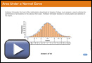
Answer the following questions about normal distributions.
- What percentage of data is within one standard deviation of the mean?
- What percentage of data is within two standard deviations of the mean?
- What percentage of data is within three standard deviations of the mean?
- What percentage of data is beyond three standard deviations of the mean?
![]()
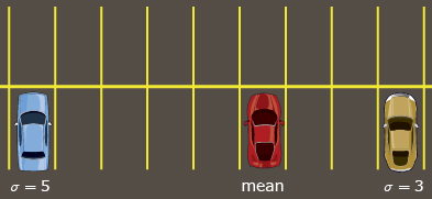
One way to help you visualize mean and standard deviation is to think about a parking lot. Suppose that you are meeting some friends at the mall. You all end up parking in the same row of stalls. Your one friend is parked five stalls away from you. Your other friend is parked three stalls away from you. The mean is your point of reference (i.e., your parking stall) and the standard deviation is how far away you are from the parking stalls where your friends are parked (i.e., five parking stalls and three parking stalls). So, your friend who is parked in the blue car is five standard deviations away from you, while the yellow car is three standard deviations away from you.
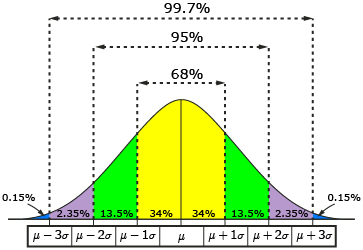
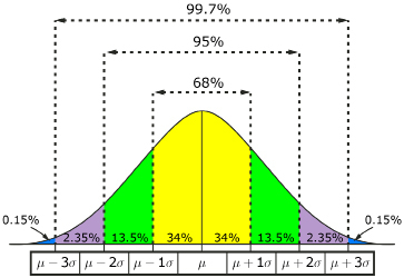
In Try This 2, you learned that you can determine the percentage of the data that falls between any two whole number standard deviations on the normal curve using the rule of 68-95-99.7. That is, 99.7% of the data is within three standard deviations of the mean. So 0.3% of the data is more than three standard deviations from the mean.
Because of its specific properties, the normal curve can be used to determine the likelihood that a certain event will occur. In other words, if you know that data is normally distributed, you can begin to look at what values you can expect to get in the future.
Read “Example 2: Analyzing a normal distribution” on pages 273 and 274 of your textbook. As you work through the example, think about how Jim uses the properties of a normal distribution to estimate the number of adult male dogs that will be within a specific weight interval.
Then read “Example 3: Comparing normally distributed data” on pages 275 and 276 of your textbook. As you complete the example, think about the factors that impact the shape of the normal curve. When the women added the weight of their baseballs and medals to their luggage, what changed in the data? Was it the mean? Was it the standard deviation?
1.5. Explore 3
Module 4: Statistical Reasoning

Hemera/Thinkstock
Normal curves are a useful tool for quality control departments as well. For instance, the normal distribution might provide an accurate model for the distribution of masses of chocolate bars produced at a factory or the lifespan of a product.
Read “Example 4: Analyzing data to solve a problem” on pages 276 and 277 of your textbook. Consider why it is important that Shirley first determine whether the data approximates a normal distribution.
![]()
To create a normal curve on top of the histogram, draw midpoints at the tops of the bars and then connect them with a smooth curve.
To create a normal curve on top of a histogram on your graphing calculator, go into STAT PLOT and turn on “Plot2.” Set the type to be a connected line graph, and use the same lists as you used for your histogram. When you press GRAPH, a frequency polygon will be displayed. If your histogram approximates a normal distribution, then your curved line will approximate a normal curve. ![]()
![]()
When attempting problems with normally distributed data, sketching the normal distribution is a very useful way to help you visualize the problem. Make sure to write down the data values on the diagram for one, two, and three standard deviations above and below the mean.
Self-Check 2
- Complete “Practising” questions 4, 8, 10, and 11 on pages 279 to 281 of your textbook. Answer
- Complete “Closing” question 15 on page 281 of your textbook. Answer
1.6. Explore 4
Module 4: Statistical Reasoning
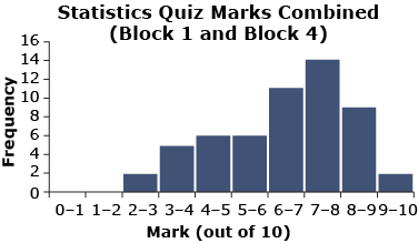
In Lesson 1 you were presented with data from Mr. Kong’s Block 1 and Block 4 statistics quiz.

The distribution for the combined quiz marks is skewed to the right. In other words, the data is not symmetrical about the mean. So the data from Mr. Kong’s Block 1 and Block 4 statistics quiz is not normally distributed. Remember that this graph is only for 55 quizzes.

These graphs represent skewed data.
Regardless of whether data is normally distributed and symmetrical about the mean or asymmetrically distributed, it is not possible for all of the data to be above the mean. Some data will always be below the mean and some data will always be above the mean. Therefore, it is not possible for all students in a class to be above average.
Self-Check 3
You can use the “Statistics and Decision Making” applet to review the concepts covered in this lesson. At the LearnAlberta website, you may be required to submit a username and a password. You can obtain these from your teacher. Then choose “Standard Deviation and the Normal Curve.” This will take you to a new page, and you should select “4: Statistics and Decision Making.”
Add the properties of a normal distribution to your notes organizer. You can use the information presented in this lesson. Or you can use the information provided “In Summary” on page 278 of your textbook. You may find information from other sources.
1.8. Lesson 3 Summary
Module 4: Statistical Reasoning
Lesson 3 Summary
Data that approximates a normal distribution has special characteristics. The graph of data that approximates a normal distribution is symmetrical and bell-shaped. The normal curve’s distinct properties make it a very useful tool for comparing data or making decisions.
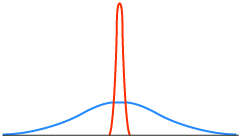
The mean of a normal curve describes the position of the normal distribution on the x-axis, and the standard deviation describes the width of the normal distribution. Here are two normal distributions with the same mean but different standard deviations.
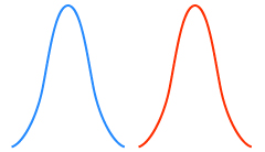
Here are two normal distributions with the same standard deviation but different means.
The spread of the normal curve is controlled by the standard deviation. The larger the standard deviation, the more spread out the data and wider the curve.
The area under the normal curve is equal to 1 since it represents 100% of the data. The majority of the data in a normal distribution is located close to the mean. As you move out to the left or to the right, the area under the curve approaches zero. About 68% of the data is within one standard deviation of the mean, about 95% of the data is within two standard deviations of the mean, and about 99.7% of the data is within three standard deviations of the mean.
The 68-95-99.7 property of normal distributions is useful for making estimates about data. For example, companies can use a normal curve to estimate what length of warranty to offer on their product.
In Lesson 4 you will investigate how the normal curve can be used to make estimates about data that doesn’t fall at exactly one, two, or three standard deviations away from the mean.