Lesson 1
| Site: | MoodleHUB.ca 🍁 |
| Course: | Math 30-3 SS |
| Book: | Lesson 1 |
| Printed by: | Guest user |
| Date: | Tuesday, 4 November 2025, 5:48 PM |
Description
Created by IMSreader
1. Lesson 1
Module 3: Algebra
Lesson 1: Linear Relations in Tables and Graphs
Focus

© karaboux/3536754/Fotolia
There are many factors to consider when you are planning to buy a new car. These include purchase price, safety, comfort, style, handling, and fuel consumption. For many people, fuel consumption is high on the list of considerations. A linear function graph, which compares the fuel consumption of a Smart car to that of a Volvo, is shown. How could you determine which car is more fuel efficient?

Some consumers find this type of graph very useful when choosing a vehicle. This leads you into the lesson on linear relations in tables and graphs.
Lesson Outcomes
At the end of this lesson you will be able to
- determine whether a graph, table of values, number pattern, or scatterplot is linear, nonlinear, or has no trend
- relate slope and rate of change to linear relations
Lesson Questions
You will investigate the following questions:
- How can you distinguish a linear relation from a nonlinear relation?
- How can you identify a linear relation?
- How can slope be used to solve problems?
Assessment
Your assessment may be based on a combination of the following tasks:
- completion of the Lesson 1 Assignment (Download the Lesson 1 Assignment and save it in your course folder now.)
- course folder submissions from Try This and Share activities
- additions to Glossary Terms and Formula Sheet
- work under Project Connection
Self-Check activities are for your own use. You can compare your answers to suggested answers to see if you are on track. If you have difficulty with concepts or calculations, contact your teacher.
Remember that the questions and activities you will encounter provide you with the practice and feedback you need to successfully complete this course. You should complete all questions and place your responses in your course folder. Your teacher may wish to view your work to check on your progress and to see if you need help.
Materials and Equipment
You will need
- ruler or straight edge
- Grid Paper Template
- calculator
1.1. Launch
Module 3: Algebra
Launch
Do you have the background knowledge and skills you need to complete this lesson successfully? Launch will help you find out.
Before beginning this lesson you should be able to
- demonstrate an understanding of slope and rate of change
- graph a linear relation, analyze the graph, and interpolate or extrapolate to solve problems
- create a table of values from a linear relation, graph the table of values, and analyze the graph to draw conclusions and solve problems
1.2. Are You Ready?
Module 3: Algebra
Are You Ready?
Complete these questions. If you experience difficulty and need help, visit Refresher or contact your teacher.
- What is a relation? Answer
- How can relations be represented? Answer
- Kim works part-time as a cashier. She makes $11.50/h.
- Complete the table showing the hours Kim works and her earnings.
Hours Worked
Kim’s Earnings ($)
1
2
34.50
46.00
-
Express the relation as a set of ordered pairs. Answer
-
Graph the relation. You may use Grid Paper Template. Answer
-
Does it make sense to connect the points? Explain why or why not. Answer
- Complete the table showing the hours Kim works and her earnings.
- Find the slope of the line in the graph shown.
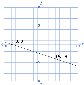
Answer
If you answered the Are You Ready? questions without difficulty, move to Discover.
If you found the Are You Ready? questions difficult, complete Refresher.
1.3. Refresher
Module 3: Algebra
Refresher
If you need help with graphing ordered pairs, work through Patterns and Relations: Graphing Patterns (Puzzles). Follow the instructions for graphing ordered pairs.
© 2010 Province of BC
Review slope in this Investigating Slope interactive.
Go back to the Are You Ready? section and try the questions again. If you are still having difficulty, contact your teacher.
1.4. Discover
Module 3: Algebra
Discover
There are many places where you will find linear relations. In the Math Lab you will investigate if the following relationships are linear relations.
Math Lab
Study the illustration of figures shown. Consider the width, area, and perimeter of each figure. Do you see a pattern?
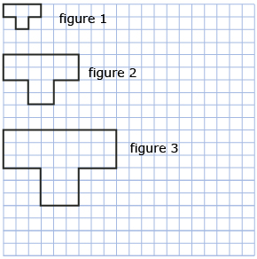
Use the illustration to answer the following questions.
- Use Grid Paper Template or your own graph paper to construct the next two figures, figure 4 and figure 5.
- Complete a table like the one shown. The first two rows have been completed for you.
Figure
Width
Area
Perimeter
1
3
4
10
2
6
16
20
3
4
5
- Graph the data for all five figures using the variables listed. You can graph by hand, electronically by using a spreadsheet, or by using Grid Paper Template.

- perimeter versus figure number
- area versus figure number
- perimeter versus width
- You have now constructed three graphs. In which of these graphs do the points form a straight line? To quickly check for a straight line, try to line a straight edge up to the points.
- What pattern do you notice in the table you completed in question 2?
- Is the pattern from question 5 present for graphs that do not form a straight line?
![]() Save your responses in your course folder.
Save your responses in your course folder.
Share 1
Share your responses and discoveries from Math Lab with a classmate. Be sure to address questions 4 to 6 in your sharing discussion.
![]() Save a summary of your discussion in your course folder.
Save a summary of your discussion in your course folder.
When graphing A versus B, B represents the horizontal axis and A represents the vertical axis.
1.5. Explore
Module 3: Algebra
Explore
linear relation: a relationship between two variables that forms a straight line when you plot values of ordered pairs on a graph
Source: MathWorks 12 Student Book/Teacher Guide. (Vancouver: Pacific Educational Press, 2011.)
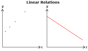
In Math Lab you probably found that some graphs produce points that lie along a straight line. This is called a linear relation.
Were all the relations that you graphed in the Math Lab linear relations? In Try This 1 you will explore how to graph a linear relation that involves wages.
Try This 1
Rashib has a job that pays him $18.00/h for 40 h/wk.
- Complete a table similar to the one shown.
Number of Hours Worked
Amount of Money Made ($)
0
0
8
144
16
24
32
576
40
- How much will Rashib earn by the end of the week?
- How much do you think he will earn if he only works 30 hours in the week? Explain.
- Does one quantity in the table depend on the other?

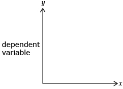
This quantity is called the dependent variable and is placed along the vertical axis.
- Is one quantity independent of the other?
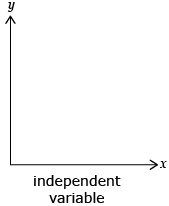
This quantity is called the independent variable and is placed along the horizontal axis.
- Graph the number of hours worked versus the amount of money made.
- Review your response to question 3. Does your graph support your estimate of earnings over a 30-h week? Explain.
![]() Save your responses in your course folder.
Save your responses in your course folder.
1.6. Explore 2
Module 3: Algebra

© nairus58/13767307/Fotolia
In Try This 1 you may have found that the dependent variable was the amount of money made, and the independent variable was the number of hours worked. Again, this is a linear relation because the points formed a straight line. You were able to use the graph to determine that after 30 hours of work Rashib should have made $540.
In Try This 1 the graph of the relation started at the point (0, 0). Do all linear relations need to start at zero? In Try This 2 you will graph a different linear relation and compare it to the linear relation from Try This 1.
Try This 2
A1 Bobcat Services charges $75/h for services rendered, plus an initial fee of $120 to reach the worksite. Estimating that a project is going to take 2 days (16 h), find the cost of hiring the bobcat and its operator.
- Complete a table similar to the one shown.
Number of Hours of Service
Cost ($)
0
120
4
420
8
12
16
- Graph the number of hours of service versus cost.
![]() Save your responses in your course folder.
Save your responses in your course folder.
Share 2
With a partner or in a group, compare the two graphs you created in Try This 1 question 6 and Try This 2 question 2. Discuss the following questions.
- How are the two graphs similar?
- How are the two graphs different?
- What term can be used to describe the rate of change in each graph?
- What term can be used to describe the starting point in each graph?
1.7. Explore 3
Module 3: Algebra
In Share 2 you should have noticed that each graph is a straight line, resulting in a linear relation.
The graph you constructed in Try This 1 should have resembled the following graph:
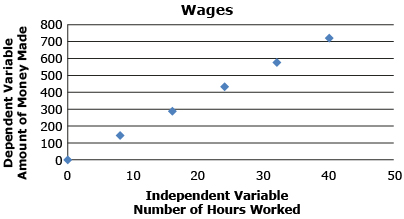
Notice that the graph is a straight line passing through the origin (0, 0), making it a direct linear relation.
The graph you constructed in Try This 2 should have resembled the following graph:
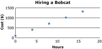
Notice that the graph results in a straight line that does not pass through the origin, or (0, 0). This is called a partial linear relation. The point where the graph touches or cuts the y-axis is called the y-intercept.
In each of the graphs, the rate of change remains constant. Recall from a previous math course that the rate of change for a straight line is also referred to as the slope of the line. The slope compares the variables x and y, meaning that the change in the dependent variable (y) is proportional to the change in the independent variable (x).
For example, the table shows that for every 8-h increase in the number of hours worked (independent variable, or x), the amount of money made (dependent variable, or y) increases by 144.
Number of Hours Worked |
Amount of Money Made |
0 |
0 |
8 |
144 |
16 |
288 |
24 |
432 |
32 |
576 |
40 |
720 |
Try This 3
Open Partial and Direct Relations and adjust the sliders to respond to the following questions.
- What characteristics of the graph can be changed for the direct linear relation?
- What characteristics of the graph can be changed for the partial linear relation?
- What effect on the line does changing the y-intercept have?
- What effect on the line does changing the slope have?
![]() Save your responses in your course folder.
Save your responses in your course folder.
1.8. Explore 4
Module 3: Algebra
A formula can be used to determine the slope of any line, as long as the coordinates of at least two points on the line are known. Search the Internet using the keywords “Montgomery County Slope of a Line.” Watch the Math Dude video, “Slope of a Line,” from start to finish. The video is a great review of what you learned about slope in Grade 11 and will introduce you to a new slope formula.
When you know two points with coordinates (x1, y1) and (x2, y2) on a line, you can determine its slope, m, by using the following formula:
![]()
Study and review the following examples and solutions in the textbook:
- “Example 1” (Rain Barrels) on page 15
- “Example 2” (Banquet Hall) on page 18

Barry Austin Photography/Photodisc /Thinkstock
Try This 4
Kole sells used cars on the Auto Mile in Wetaskiwin, Alberta. The graph shows his remuneration, or amount of pay, versus his sales for the month of July.
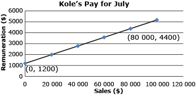
- What does the point (0, 1200) represent?
- What does the point (80 000, 4400) represent?
- Using the slope formula,
 , calculate the slope of this line.
![]() Save your responses in your course folder.
Save your responses in your course folder.
Share 3
With a partner or in a group, discuss the following question:
- The slope of the line in Try This 4 is a decimal. Convert the decimal to a percent, and explain the meaning of the percent in relation to the question.
![]() Save your summarized response in your course folder.
Save your summarized response in your course folder.
1.9. Explore 5
Module 3: Algebra
In Share 3 you may have come to the conclusion that 0.04 is equal to 4%. This represents the rate of commission. Commission is when you receive a percentage of the amount of sales you make. In some cases, like in Try This 4, employees are paid a base salary plus a commission.
In Kole’s case at the Wetaskiwin Auto Mile, he makes 4% commission on his total sales for the pay period. Notice that Kole will still earn $1200, his base salary, even if he has no sales.
Share 4
With a partner or in a group, discuss the following questions.
- Under what conditions might sales be 0?
- Why might it be beneficial to have a job that pays using a base salary plus commission rather than just commission?
![]() Save your summarized responses in your course folder.
Save your summarized responses in your course folder.
Try This 5
- Complete a table like the one shown.
Side Length (cm) of One Edge of a Cube
Perimeter (cm) of One Face of a Cube
Area (cm2) of One Face of a Cube
Volume (cm3) of a Cube
1
4
1
1
2
8
4
8
3
12
9
27
4
5
6
-
Use the table to graph the following relations:

iStockphoto/Thinkstock
- perimeter versus side length
- area versus side length
- volume versus side length
![]() Save your responses in your course folder.
Save your responses in your course folder.
Share 5
With a partner or in a group, discuss the following questions:
- Which of the graphs from Try This 5 question 2 were linear?
- Which of the graphs from Try This 5 question 2 were not linear?
![]() Save your summarized responses in your course folder.
Save your summarized responses in your course folder.
1.10. Explore 6
Module 3: Algebra
nonlinear relation: a relation whose ordered pairs on a graph do not lie on a straight line
Source: MathWorks 12 Student Book/Teacher Guide. (Vancouver: Pacific Educational Press, 2011.)
Some of the graphs in Share 5 did not follow a straight line. Therefore, the graphs were not linear. These types of graphs are called nonlinear.
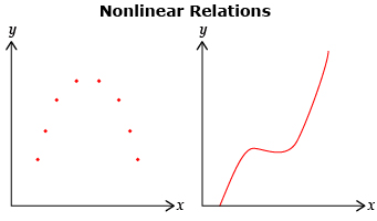
Read through “Example 3” on page 20 of the textbook. Check your responses with the solutions provided on the same page. This example will give you more reinforcement to help your understanding of linear and nonlinear relations.
Self-Check 1
Answer “Build Your Skills” questions 1 to 4, 7, and 8 on pages 22 to 25 of the textbook. Answer
Add the following terms to your copy of Glossary Terms:
- linear relation
- dependent variable
- independent variable
- direct linear relation
- partial linear relation
- slope
- nonlinear relation
1.11. Connect
Module 3: Algebra
Complete the Lesson 1 Assignment that you saved in your course folder at the beginning of the lesson. Show work to support your answers.
![]() Save your responses in your course folder.
Save your responses in your course folder.
Project Connection
You are ready to start working on Module 3 Project: Household Water Conservation. Go to the Module 3 Project and read over all project requirements. Become familiar with what you will be doing and how you will be assessed.
Your Module 3 Project will be evaluated by your teacher using the evaluation guidelines in the Module 3 Project Rubric. Read the rubric carefully. Make sure you are aware of how you will be assessed. You can print or save a digital copy of the rubric.
![]() Save your responses in your course folder.
Save your responses in your course folder.
1.12. Lesson 1 Summary
Module 3: Algebra
Lesson 1 Summary
In this lesson you looked at examples of linear and nonlinear relations. Linear relations yield graphs that form a straight line.
The slope of a straight line can be found using any two points and the formula ![]() .
.
Direct linear relations pass through the origin (0, 0); and partial linear relations do not.
Nonlinear relations yield graphs that are not straight lines.

