Lesson 3
| Site: | MoodleHUB.ca 🍁 |
| Course: | Math 30-3 SS |
| Book: | Lesson 3 |
| Printed by: | Guest user |
| Date: | Saturday, 1 November 2025, 1:17 AM |
Description
Created by IMSreader
1. Lesson 3
Module 3: Algebra
Lesson 3: Scatterplots and Linear Trends
Focus

© Chlorophylle/4776576/Fotolia
We often hear in the news that some product is linked with an increased risk of health issues.
On May 31, 2011, the World Health Organization warned the public that the radiofrequency electromagnetic fields associated with the use of wireless phones increases the risk of glioma, a malignant type of brain cancer.
Have you ever noticed that it is seldom said that the product actually causes health problems? Instead, these warnings usually indicate that an item or product increases the risk of health problems. How are these risks being determined, if they are not an absolute cause?
In this lesson you will learn about how to compare two variables and determine if there is a correlation between them.
Lesson Outcomes
At the end of this lesson you will be able to
- create, with or without technology, a graph to represent a data set, including scatterplots
- describe the trends in the graph of a data set, including scatterplots
- construct a line of best fit for a scatterplot
Lesson Questions
You will investigate the following questions:
- How does a line of best fit relate to the correlation of two variables?
- What are the uses and limitations of a line of best fit?
Assessment
Your assessment may be based on a combination of the following tasks:
- completion of the Lesson 3 Assignment (Download the Lesson 3 Assignment and save it in your course folder now.)
- course folder submissions from Try This and Share activities
- additions to Glossary Terms
- work under Project Connection
Materials and Equipment
You will need
- ruler or straight edge
- Grid Paper Template
- calculator
1.1. Discover
Module 3: Algebra
Discover
Try This 1
Go to Scatter Plots—Activity A to discover negative and positive trends. As you work with this activity, think about the following questions:

Screenshot reprinted with permission of ExploreLearning
- What do you notice when you toggle the “Negative trend” and “Positive trend” buttons?
- Select “Adjust trend” and move the slider. What happens to the scatterplot graph?
- Select “Show actual trend line” and move the slider. What happens to the equation of the line?
Answer the questions that follow the Scatter Plots—Activity A interactive. Did you get the questions all correct? (You can click on “Check your Answers” to find out.) If you made a mistake and can’t correct your error, consult your teacher or a partner for help.
![]() Save your responses in your course folder.
Save your responses in your course folder.
Share 1
With a partner or in a group, share your findings from Try This 1. Be sure to address the following questions:
- What is meant by negative trend and positive trend?
- What happens to the points on the scatterplot as you adjust the slider from “Negative trend” to “No trend” to “Positive trend”?
-
- When is the slope of the trend line positive?
- When is the slope of the trend line negative?
![]() Save your summarized responses in your course folder.
Save your summarized responses in your course folder.
1.2. Explore
Module 3: Algebra
Explore
Before continuing, look over some definitions so you don’t find yourself lost in the terminology.

AbleStock.com/Thinkstock
A scatterplot is a graph of ordered pairs, used to evaluate what type of relationship (if any) exists between two variables.1 As shown in the graphic, the spray of water droplets can serve as the display of points on a scatterplot.

iStockphoto/Thinkstock
A line of best fit is a line drawn on a scatterplot to show the general trend in the data.2 The penguins are travelling along a path that is close to linear, therefore, a line of best fit can be imagined.

iStockphoto/Thinkstock
Correlation is the degree of relatedness between variables.3 What is the relationship between the rainbow and the blue sky? What must have just happened in order for the rainbow to occur?
1–3 Source: MathWorks 12 Student Book/Teacher Guide. (Vancouver: Pacific Educational Press, 2011.)
1.3. Explore 2
Module 3: Algebra
Try This 2
Dive a little deeper into your understanding of scatterplots and linear trends! Go back into Scatter Plots—Activity A.
Screenshot reprinted with
permission of ExploreLearning
Select “Adjust trend,” and complete the following.
- Move the slider from “No trend” to “Positive trend,” and pay attention to the scatterplot. What do you notice? At what point on the slider is there a correlation, and when is there no correlation?

- Move the slider from “No trend” to “Negative trend,” and pay attention to the scatterplot. What do you notice? Again, at what point on the slider is there a correlation, and when is there no correlation?
![]() Save your responses in your course folder.
Save your responses in your course folder.
You should notice the following:
- There is still no correlation at the “No trend” point of the slider.
- As you move the slider from “No trend” to “Negative trend,” the correlation becomes stronger.
- Recall that the correlation also became stronger when the slider was moved from “No Trend” to “Positive Trend.”
You should notice the following:
- At the “No trend” starting point, there is no correlation.
- As you move the slider from “No trend” to “Positive trend,” the correlation becomes stronger.
1.4. Explore 3
Module 3: Algebra
From Try This 2 you should have discovered that the
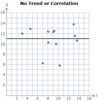
- strongest correlation occurs when the points of the scatterplot lie along a straight line
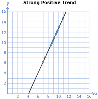
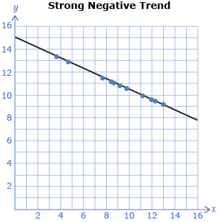
- weakest correlation or no correlation occurs when the points are scattered without evidence of a trend
1.5. Explore 4
Module 3: Algebra

Zoonar/Thinkstock
There is a special name for the points that lie beyond the trend. They are called outliers. As shown in the scatterplot graphs, when little or no outliers are present, correlation is strongest. With the presence of many outliers, correlation is weaker.
Outlier(s) is/are data point(s) that lie significantly outside the general trend of the data.
Source: MathWorks 12 Student Book/Teacher Guide.
(Vancouver: Pacific Educational Press, 2011.)
Try This 3
Go back into Scatter Plots—Activity A.

Screenshot reprinted with permission of ExploreLearning
Select “Show actual trend line.”
What happens to the slope of the line from the equation as you move the trend slider from negative to positive?
Remember that y = mx + b is the equation of a line, and m represents slope.
![]() Save your response in your course folder.
Save your response in your course folder.
Take note of the following:
- Positive correlation occurs when the slope of the line is positive (i.e., rising to the right).
- Negative correlation occurs when the slope of the line is negative (i.e., falling to the right).
Try This 4
Complete “Discuss the Ideas” questions 1, 2, 3, and 4 on pages 49 and 50 of the textbook.
![]() Save responses to your course folder.
Save responses to your course folder.
Share 2
Share your responses to Try This 4 with a partner or a group.
- Were your responses to the questions the same as or different than the others? Explain.
- Through this share activity, have you improved your understanding of this concept? Or were you able to help your partner or others in the group improve their knowledge and understanding? Explain.
![]() If required, place a summary of your discussion in your course folder.
If required, place a summary of your discussion in your course folder.
1.6. Explore 5
Module 3: Algebra
Self-Check 1
Read “Example 1” on page 51 of the textbook. Then complete questions a. to d. at the bottom of the page. Check your answers with the solutions provided on page 52 of the textbook.
Self-Check 2
- Describe the correlation for each of the following scatterplots.
- From the scatterplots shown, is there one (or more) that has an outlier? Answer
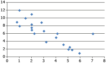
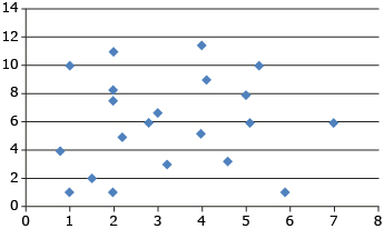
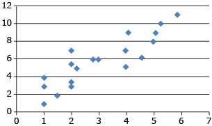
You have now had some practice in determining and interpreting a line of best fit. When one or two outliers are present, they normally don’t have an effect on the line of best fit.
1.7. Explore 6
Module 3: Algebra
Self-Check 3
![]()
- Read "Example 2" on page 53 of your textbook. Then answer questions a. to d. Cover the solutions at the bottom of the page until you have completed the questions. Once you have finished, check your answers with the solutions provided on pages 53 to 55.
- Using the scatterplot on page 53 of your textbook, what approximate fuel economy do you think you would have for a 900 kg and 2500-kg vehicle on the highway and on city streets? Answer
- Using the scatterplot on page 53 of your textbook, what approximate fuel economy do you think you would have for a 1750-kg vehicle on the highway and on city streets? Answer
In calculating the fuel economy for a 900-kg vehicle and the 2500-kg vehicle, the weights were “outside” of the given data values. This is called extrapolation. If asked to find a value within the given values—for example, 1750 kg—this is described as interpolation.

Hemera/Thinkstock
1.8. Explore 7
Module 3: Algebra
Self-Check 4
![]()
Answer “Build Your Skills” questions 1, 2, 3, 4, 6, 7, and 8 on pages 60 to 65 in your textbook. In order to complete questions 3, 4, 6, 7, and 8, you will need Blackline Master 1.8. Answer
Add the following terms to your copy of Glossary Terms:
- scatterplot
- line of best fit
- outlier
- correlation
- extrapolation
- interpolation
1.9. Connect
Module 3: Algebra
Complete the Lesson 3 Assignment that you saved in your course folder at the beginning of this lesson. Show work to support your answers.
You may find it helpful to use Grid Paper Template to complete question 3.
![]() Save your responses in your course folder.
Save your responses in your course folder.
Project Connection
You are now ready to apply your understanding of scatterplots and linear trends to Module 3 Project: Household Water Conservation. Go to the Module 3 Project, and complete Part 3.
Save your responses in your course folder. You have now completed the Module 3 Project.
Submit your Module 3 Project to your teacher.
1.10. Lesson 3 Summary
Module 3: Algebra
Lesson 3 Summary

Wavebreak Media/Thinkstock
In Focus of this lesson, you discovered how some products are linked to an increased risk of health issues. However, there is rarely a definite indicator that the product is the actual cause of the health issue. Since there are often many variables to consider in research studies, researchers can only be as confident as the data collected. This data may be graphed as a scatterplot, which will then help researchers determine if there is a correlation or trend in the variables.
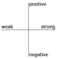
You do not have to be a health scientist to work with scatterplots, correlation, and lines of best fit. You only need to have an inquiring mind to determine if one thing affects the results of another. For example, what kind of correlation is there between the time you spend studying and your success with the course—positive or negative? weak or strong? Which quadrant would you place an X in to represent the correlation in question?
In this lesson you looked at examples of scatterplots and determined if a line of best fit can be drawn to represent a trend. When most of the points lie along a straight line, the correlation is strong. If not, the correlation is weaker. From the line of best fit, you can interpolate and extrapolate to help make decisions about the data that is presented to you in a scatterplot.