Principles of Design
Session 2: Principles of Design
Contrast
|
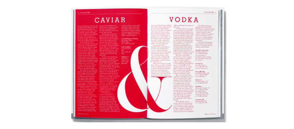
Contrast in composition occurs when two related elements are different. The greater the difference the greater the contrast. Contrast adds variety to the total design and creates unity. It is what draws the viewer's eye into the composition and helps to guide the viewer around the art piece. Some ways of creating contrast among elements in the design include using contrasting colours, sizes, shapes, locations, or relationships. For text, contrast is achieved by mixing serif fonts with sans-serif fonts on the page, by using very different font styles, or by using fonts in surprising or unusual ways. Another way to describe contrast is to say "a small object next to a large object will look smaller". As contrast in size diminishes, monotony is approached. Contrasting ColoursNow that you have a basic understanding of colour, it is important to examine the concept of contrast. Contrast creates emphasis in printed and graphic objects, in web pages or in videos. It can be developed through the use of contrasting colours. Contrast is the perceived difference between two adjacent colours. Because white and black are not really colours, they are said to represent achromatic contrast. Black and white also represent the highest level of contrast. Complementary colours from the colour wheel represent high chromatic contrast.
Also known as contrasting colours, complementary colours are directly opposite each other on the colour wheel. Selecting contrasting colours is useful when you want to make the colours stand out more vibrantly. If you are composing a graphic using lemon yellow, using a blue background will make the yellow stand out more. The same sort of effect happens with warm and cool colours. The warm colours are perceived as advancing out of the screen slightly, and the cool colours recede. Contrasting Text and BackgroundsDeveloping contrast with text can be as simple as making one word bold or italic so that it will stand out from the rest of the sentence. Using larger text or a different font for a title helps to produce contrast that organizes information. When it comes to readability on a computer screen, black text on a white background is highly recommended. It produces the greatest amount of contrast and is best for most readers. Other text colours may be used as long as they contrast well with the background colour.
Be aware that eyesight issues may cause the viewer to have difficulty differentiating between colours that are similar. Lettering that doesn't have enough contrast may be difficult to read when used together on screen or in print (see the black and blue or white and yellow "contrast" example above). Coloured backgrounds that include patterns and textures can be especially problematic. Keeping things simple, like Apple's famous iPod advertisements, were great examples of contrast. They were also very effective as they are instantly recognizable. The ads expertly used contrast to focus the viewer's attention on the music player. The ads featured a silhouetted character on a brightly coloured background. The iPod and earphones appear in white and stand out clearly against the silhouettes and coloured backgrounds. Contrast with SizeBig and small elements of the same type, such as big and small images and big and small type are the most obvious uses of size to create contrast. Contrasting white space, or the physical size of the piece, with another element of the design is another method to achieve contrast. Things you may want to ask yourself:
|
||||||
|


 Try This: