Elements of Design
Session 1: Elements of Design
Categories of Value
Tint:
Adding white to colour paint to create lighter values such as light pink or blue. Shade:
Adding black to paint to create dark values such as dark blue or dark red. High Key:
A high-key image consists primarily of light tones, without dark shadows. A photograph or painting so composed features a diminished tonal range of primarily whites and light grays. Low Key:
A low-key image consists primarily of dark tones. A painting or image is low key if its dominant values are dark. Value Contrast:
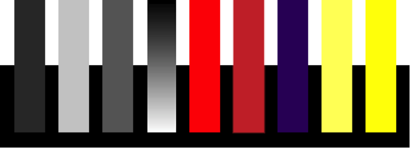
Light values are placed next to dark values to create contrast or strong differences. Look at the examples above and ask yourself which bars stand out the most against their surroundings. The first, (dark) bar is clearly visible against the white background but barely visible against the black. The second, (light) bar 's contrasts are the opposite. The third (gray) bar is equally visible against both black and white but not as visible as the high contrast areas of the first two bars. The fourth (black to white) bar has maximum contrast at either end. The coloured bars add hue and saturation as variables. The two red bars are middle values and contrast equally with black and white. The brightness of the red, however, makes it more visible. The violet bar corresponds to the first dark gray bar in contrast -- high against white but low against black. The two yellow bars correspond with the second light gray bar in contrast. The brighter yellow does make that bar more visible even against the white -- but that contrast is still low and will be noticeable only depending ont the background. For example, against black it has both strong value contrast and strong colour appeal. Value Scale:
Ascale that shows the gradual change in value from its lightest value, white to its darkest value black. |
||||||
|


 Try This
|
a) |
causes elements of the design to stand out or recede; or, |
|
b) |
directs the eye to specific information; or, |
|
c) |
creates a mood (Describe that mood. Is it quiet elegance, high tech, or playful? Is it high energy or calm and soothing?) |
2. With paper and pencil, or in your favorite graphics program, experiment with using value. Draw simple shapes such as circles and squares. Place objects ranging from light to dark on light and dark backgrounds. Mix objects of different values and create static and dynamic groupings. Experiment with using light type on dark backgrounds. Which combinations of light and dark values are easiest to read?
Here is a short video which shows how to use Adobe Illustrator to adjust value and a video on how to add gradients to shapes in Microsoft Word: