Session 1: Elements of Design

Texture and Pattern

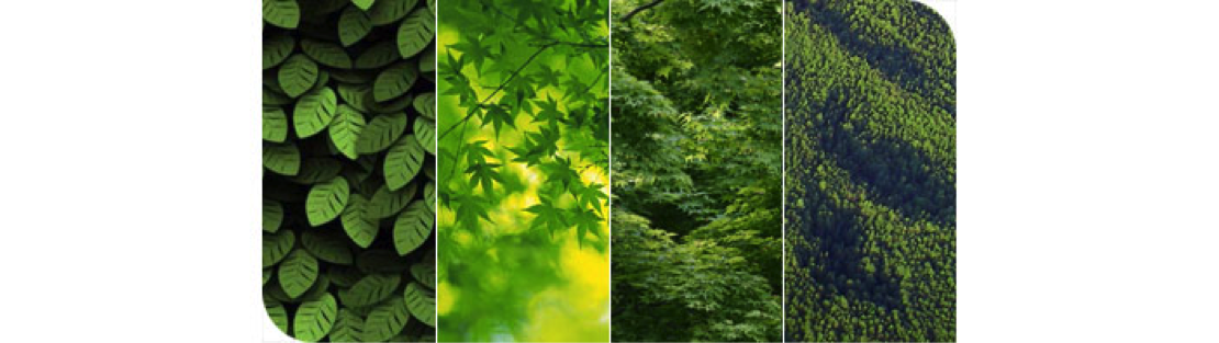
Texture is the surface quality or the perceived surface quality. In the creation of visual design, there are two types of texture: real and implied.

Textures range from the smoothest polished mirror to the roughest mountain range as seen from an airplane. The term is often misused to refer only to rough surfaces but this is not correct. All surfaces have texture.

A designer recognizes that different textures can affect interest in different ways. Some surfaces are inviting and some are repellent and so are the textures that suggest those surfaces. Using different textures can increase interest in a composition by adding variety without changing colour or value relationships.

While texture can make an image more interesting it is not a strong enough element to be useful for organizing a composition. Value and colour contrasts are more efficient at that.

Categories of Texture:

Tactile (Real):

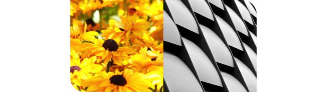
*this is obviously not tactile - it is impossible to recreate tactile texture on a screen

Tactile means touch. Tactile texture is the actual (3D) feel of a surface. This is of paramount importance to three-dimensional design but of only moderate interest in two-dimensional design. Examples of this include sandpaper, cotton balls, tree bark, puppy fur, etc.

Implied (Visual):

Visual texture refers to the illusion of the surface's texture. It is what tactile texture looks like (on a 2D surface). The textures you see in a photograph are visual textures. No matter how rough objects in the photograph look, the surface of the photograph is smooth and flat. The texture may look rough, fizzy, gritty, but cannot actually be felt.

Pattern

A recognizable motif regularly repeated produces a pattern. Pattern requires repetition -- in design as in life (a pattern of behavior). The more regular the repetition, the stronger the pattern. Compare this field of flowers with a side of a building. Both have a repeating motif.

The most noticeable patterns occur when you see the group before the individuals -- notice the organization first (the building). All of the motifs in a pattern have surfaces, so there is always texture. But there is not always pattern -- only when you notice it.

Texture and pattern are related. When you look closely at a tree you can see the pattern of leaves that make its surface. When you back away you lose awareness of the leaves and notice the texture the leaves make on the tree. Farther away still and you can see the pattern of the trees making up the forest and finally the texture of the forest. In this way pattern changes to texture as you lose sight of the individual motifs. This is easy to do with natural patterns, but you have to get quite far away from a building grid to see it as texture.

Patterns are generally more noticeable than textures. This makes them a stronger visual element for controlling attention.

The Principles of design can be thought of as what we do to the elements of design. How we apply the Principles of design determines how successful we are in creating a successful visual communication.

Try This:

While no one but you may see this hands on exercise, take the time to do it just as if you were turning it in for a grade. It will help reinforce what you have learned.

1. Create different 4 different types of textures. Explain what the texture is at the bottom of each box.

2. Draw a pattern of uniform black squares or circles on a piece of white paper. Now draw that same pattern but make one of the circles or squares red — just one. How does it change the overall effect?

3. Design a simple pattern with 20 or more shapes in it (a 4 by 5 grid for instance). Use quilt patterns as an inspiration for your pattern. Into each shape of the pattern put a sample of a different texture, like different fabrics are used in a quilt.

Organize the samples in a way that makes it easy to see the pattern. Remember that value is the strongest contrast, and hence organizing element available to a designer. Colour differences are also strong ways to separate or group items in a composition. Notice how traditional quilts use similar values and colours to make a larger pattern out of the smaller blocks they are made from.

Here are a few quilt examples to help inspire you:

Â