Elements of Design
Session 1: Elements of Design
Colour
|
Colour is seen either by the way light reflects off a surface, or in coloured light sources. Colour and particularly contrasting colour is also used to draw the attention to a particular part of the image. There are primary colours, secondary colours, and tertiary (third level) colours. Complementary colours are colours that are opposite to each other on the colour wheel. Complementary Colours:The complementary colour of a primary colour (red, blue, or yellow) is the colour you get by mixing the other two primary colours. So the complementary colour of red is green, of blue is orange, and of yellow is purple. The complementary of a secondary colour is the primary colour that wasn't used to make it. So the complementary colour of green is red, of orange is blue, and of purple is yellow. An easy way to determine a complementary colour is that they are directly opposite on a colour wheel. Analogous Colours:Analogous colours are colours that are found side by side on the colour wheel. These can be used to create colour harmony. Orange, yellow-orange, and yellow are an example of analogous colours. They are blended nicely in Sunflowers, a painting by Vincent Van Gogh. How do you know that these colours are closely related? They share a colour—each of them contains some yellow.
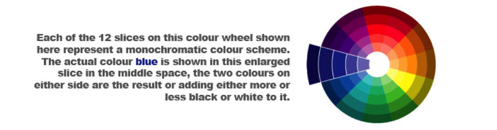
Vincent Van Gogh Sunflowers (1888) Monochromatic colours: Monochromatic colour schemes are derived from a single base hue, and extended using its shades, tones and tints (that is, a hue modified by the addition of black, gray (black + white) and white). As a result, the energy is more subtle and peaceful due to a lack of contrast of hue. Monochromatic colour schemes may be considered boring unless there is diversity within the design. Warm & Cool Colours: Warm colours are a group of colours that consist of reds, yellows, and oranges. Cool colours are groups of colours that consist of purples, greens, and blues. Colour Theory:Understanding and utilizing colour effectively comes more easily to some than others; however, one thing is certain–the study of colour deserves your attention. It is a powerful and highly provocative design element. Colour is difficult to control when creating an original work, and even more so when work is reproduced in print or viewed on a computer screen. Hue:
Hue is the name of the colour, for example, red or green, blue or orange. Value:
Value is the range of lightness or darkness, for example a light green or a dark green, a light yellow or dark yellow. Shade, tone, and tint are different aspects of value. Saturation:
Saturation is the brightness or dullness of a colour, that is, bright red (100%) or dull red (10%), bright blue or dull blue. Chroma and intensities are synonyms for saturation. |
|


 Try This: