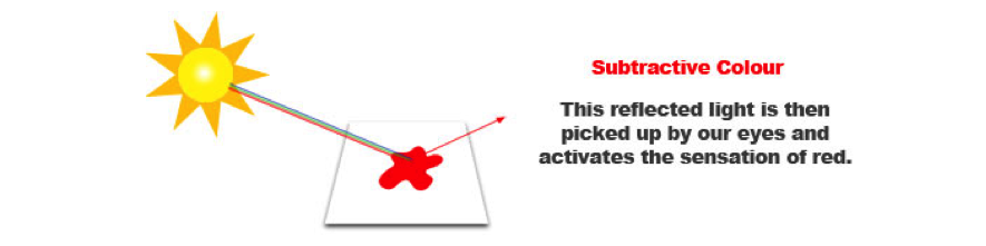
All objects that surround us are made of different materials and all these materials have the property of absorbing or reflecting light.
Imagine a sheet of paper, the paper appears white, because it reflects all the light that hits it.
If we drop red ink on the paper, the pigment in the ink absorbs most of the blue and green light but at the same time reflects the red light.
If you add a drop of yellow to the red ink the pigments will mix and the resulting pigment will still reflect the red light and part of the green light. This combination, will create the sensation of orange
This system of creating colours by mixing pigments is called subtractive, because pigments absorb (or subtract) light from the white light that hits the paper. Only the wavelengths that are reflected combine in our eyes to create the colour that we see.
In paint or pigment such as water colours, oils, or coloured pencils, the subtractive primary colours are red, yellow, and blue. As mentioned earlier they are called primary colours because they cannot be mixed; yet other colours can be mixed from them. Mix red and yellow and you get orange. Mix yellow and blue and you get green. Mix red and blue and you get violet. Orange, green, and violet are the secondary colours. You can mix these colours and get numerous variations.
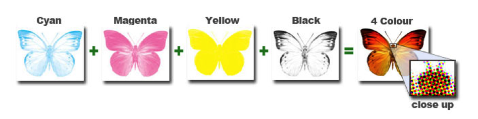
CMYK Colour
The printing processes use subtractive colours to create all the colours that we can see on a printed surface.
In most colour printing, the primary ink colours used are cyan, magenta, and yellow. Cyan is the complement of red, meaning that cyan acts like a filter that absorbs red. The amount of cyan applied to a paper will control how much red will show. Magenta is the complement of green, and yellow the complement of blue. Combinations of different amounts of the three inks can produce a wide range of colours; this is how artwork reproductions are mass-produced. These three inks, when combined together in equal proportions should result in black but it results in a dark, muddy brown instead. Black ink is therefore added to the mix to obtain a real black and to give more depth to printed images. This mixture is called CMYK.
Watch this short video which recaps subtractive colour mixing:
So, printing actually uses four colours that are considered primary: Cyan, Magenta, Yellow and Black, abbreviated as CMYK also known as four-colour process printing. Four–colour process is used to reproduce colour photographs, artwork, and illustrations. The viewer perceives full colour that is created by dot patterns of cyan, magenta, yellow, and/or black.
The number of colours that can be reproduced in printing is smaller than the number of colours that can be seen on a computer screen. There are three main reasons for this:
1
Part of the light gets absorbed by the paper and by the inks.
2
Printing inks contain impurities that prevent them from becoming pure primary colours.
3
Combination of water and ink to print on paper. The water has the effect of making the inks somewhat less bright.
For these reasons, printed colours can never be true to nature and can only approximate colours that we can see on a computer screen or on a photo.
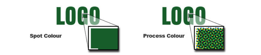
Spot Colour Printing
In offset printing, another way to produce colour is by using spot colour–a colour that is printed with its own separate ink, as opposed to creating a specific colour from process colour. Most often spot colour is used when three or fewer colours are indicated in the design. Using more than three spot colours is very expensive. For indicating and creating spot colour, a popular colour matching system called Pantone matching system is used.
Check out this short video, which reviews spot vs. process colour printing:
Additive Colour
So far we have been talking about colour on a surface, painted or printed on like a movie poster, but we need to further define colour a bit, because working with other mediums that produce their own colour, like a computer monitor or TV things change a bit.
Computer monitors, projectors, iPods, smart phones, television etc. work the way our eyes work. They emit red, green and blue light and the combination of these three lights in various quantity and intensity creates the millions of colours that we can see on the screen.
When the three lights are beamed in the same proportion and intensity, the result on the screen is white. When there is no light emitted, the result is black.
This system of creating colours is called additive because the three primary lights, Red, Green and Blue (RGB) are added together to form the white light.
Computer monitors can reproduce a large variety of different colours but they can reproduce only a smaller subset of all the colours present in nature due to impurities present in the materials that emit light and to the characteristics of the screens.
When using additive colour you can produce many more colours than when printing using subtractive colour. Since a lot of the work you will do is done digitally and then transferred to a printed format you need to be aware that what you see on the screen is not necessary what you will see in the final output. To alleviate this understanding colour theory is a very important element of good design. Talking with a printer is always a great source of information before doing your work so that you can work to their specifications. Using a common form or colour is also important and the most accepted form or colour matching is known as Pantone Colour.
Pantone Colour
A colour matching system is a standard reference used by designers to communicate about colour with clients and printers. Using the Pantone matching system, the designer specifies colours by indicating the Pantone name or number. For example. Using a colour matching system ensures that the colour printed from the digital file is the colour intended, though it may look different when viewed on a colour monitor. It is always advisable to work closely with the printer to ensure colour correctness. Also, it is advisable to investigate the different printing inks available; for instance, non-toxic, non-flammable, and nonpolluting inks are available.
Rather than using the more common colour picked in most graphics programs use the "Colour Libraries" option (see red arrow). You can select the exact colour you want from the pantone colour palette that way you can be assured that the final printed version will be the right colour. Many people who do not know these subtleties are very disappointed when they compare what prints out to what's on the monitor. There is an automatic indicator that the colour you have selected is not achievable by subtractive colour (CMYK) (see small yellow circle with an exclamation in it).
Conclusion
There have been many scientific studies of colour, as well as many unscientific theories. Most of what you need to know about colour in its use in graphic design will come from experimentation, experience with print production, asking printers questions, getting colour advice before going to print, and observation. In graphic design, colour depends on the use of printing inks, so colour choices can be dictated by budget constraints and paper selection, as well as project needs.
Allow your design solution to guide your colour choices; some colours are more appropriate than others for certain problems and brands or groups. For example, if you were to design a one-colour logo for an American Insurance Company, you would probably not choose pink. In American popular culture, pink may be thought as a frivolous colour and therefore would not be appropriate.
If you make keen observation habit when looking at existing packages, posters, web sites, or any other design, it will become an integral part of your design education. You may have noticed that gold, for example, is used in the package design of cosmetics; it is associated with luxury and quality. Try not to lock yourself into using your favorite colour in all your design solutions. Experimentation, experience, and keen observation will help you develop the ability to use and control colour.
Try This:
While no one but you may see this hands on exercise, take the time to do it just as if you were turning it in for a grade. It will help reinforce what you have learned.
1. Imagine you are going to design a tri-fold brochure for a local business. What are 5 questions that you would need to ask the client and 5 of the printer to complete the task that would effect the use of colour in the project.
2. Find 3 examples of 4 colour process printing where you can see evidence of this printing process.


 Try This: