Typography
Session 3: Typography
Classification
|
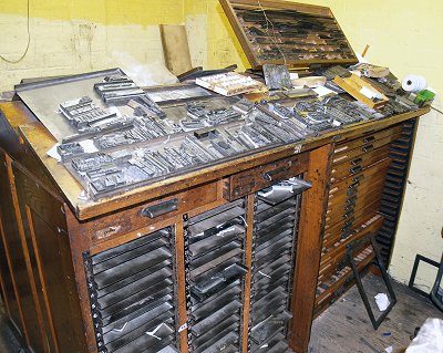
A tremendous variety of type styles is available today. Digital typography, with its simple and economical ability to create new typefaces. In addition, we have access to the entire array of typefaces developed over the centuries. In the past a typesetter would have to buy a type tray, called a "California Job Case", made of metal or wooden type. The 'type setter' would place each individual letter in the correct order to make a page layout. It was painstaking work. A page of type could take hours and hours to complete to prep for printing. Now you can buy most typefaces online as software for most computers.
Check out this short video on typography: A number of efforts have been made to classify typefaces, with most falling into the following major categories. Serif typefaces, like Times, have the little feet and variable line widths which make them easy to read. Sans serifs typefaces do not have little feet and are more common on websites. There are also decorative, stylized, or novelty classifications for the wide range of fanciful type styles that defy categorization and are usually used to catch the viewer's attention, as in a headline for example, for example.
The style of Roman letter that is most directly descended in form from chisel edge drawn models. The style is characterized by angle and bracketed serifs, biased stress, less thick and thin contrast. Some examples are Caslon, Garamond, Palatino, and Times Roman.
A style of Roman letter that exhibits design characteristics of both modern and old-style faces. For example, Baskerville, Century Schoolbook, and Cheltenham.
A style of Roman letter whose form is determined by mechanical drawing tools rather than a chisel-edged pen. This sytle is characterized by extreme thick and thin contrast, vertical/horizontal stress, and straight on, bracketed serifs. For example, Bodini, Caledonia, and Tiffany.
Also known as Slab Serif is a style of Roman letter characterized by heavy, slab like serifs. The thin strokes are usually fairly heavy. It may have modern or old-style design qualities that are sometimes called square serif or slab serif. For example, Claredon, Egyptian, and ITC Lubalin Graph.
This is a letter form design resembling handwriting with the notes appearing at an angle or slant to the right. This style was originally used as an independent design alternative to Roman. It is now used as a style variant for a typeface in a type family that applies to most serif and sans serif typefaces.
Script is letterform design that most resembles handwriting. Letters usually slant to the right and are joined. Script type can emulate forms written with chisel edge pen, flexible pen, pencil, or brush. For example, Brush Script, Shelley Allegro Script, and Snell Roundhand Script.
Sans serif letter forms are designed without serifs and usually have no discernible thick and thin variations. For example, Futura, Helvetica, and Univers. A typeface is a style of lettering, such as Helvetica or Times. A font is the set of a typeface, used to produce the letters. On a computer, it is a file used by the system. People often confuse "font" with "typeface". For example, Helvetica, point 12 is a different font from Helvetica, point 14, even though both are of the same typeface.
A set of similar typefaces is called a "family." Within a family, typefaces are categorized as parent (e.g. Times, Helvetica) or relative (e.g. bold, italic). Typefaces are categorized also according to style (e.g. italic, book), weight (e.g. bold or light), and width (e.g. expanded). |
|


 Try This: