|
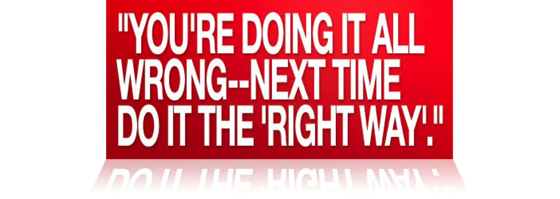
Can you see what’s wrong with the statement above?
Bad typography is everywhere. It can be found in magazine articles, outdoor signage, restaurant menus, billboards, newspaper and TV advertisements, and all over the internet. Spend just 30 seconds looking and you will see that it is easy to find incorrect hyphenation, ‘dumb’ quotes, double-spacing, widows, orphans, poor kerning (distance between individual letters)… the list goes on. Typography is something every designer should care about because there is a correct way to do things.
Technology is a major barrier in the way of good typography. There aren’t enough keys on a computer keyboard to have separate keys for hyphen, em-dash and en—dash (see link), or for separate open and closed, single and double quotation mark keys. Designers have to rely on keyboard shortcuts to find the characters they need, and some don’t even have keyboard shortcuts at all. In that case a character viewer such as PopChar on the Mac is needed, or several minutes of srolling through Alt character tables on Windows.
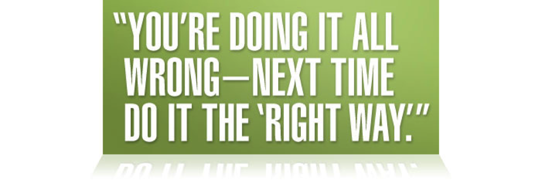
Here is how the statement above should look.
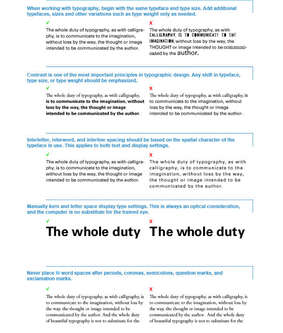
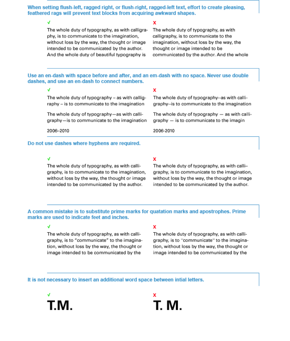
Here are some basics to follow when doing text layout to maximize readability and help you from making typographic errors.
|
 Try This: