Elements of Design
Completion requirements
Value Contrast
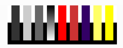
The relationship of one element to another in respect to lightness and darkness is called value contrast. Value contrast enables us to discern images and perceive detail. We need value contrast to read words on a page. If the words are close in value to the colour of the page, then reading them will be difficult, if not impossible. Most text type is black and the page white to achieve maximum contrast.
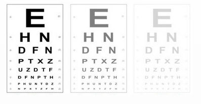
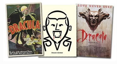
Various value relationships produce various effects, both visual and emotional. A narrow range of values, which is called low contrast, used in the design evokes an emotional response from the viewer. The emotional response is different when the design has a wide range of values, or high contrast. The high contrast in these posters captures one's attention easily.
Light values are placed next to dark values to elicit contrast or strong differences.