Principles of Design
Balance
Try walking a long distance with a 2-kg bag of rocks in one hand and a 10-kg bag of marbles in the other. After a while, you'll be wanting to shift your load around, putting a few marbles in the rock bag to balance your load and make walking easier. Balance in design works in a similar fashion. Visual balance results from arranging elements on the page so that no one section is heavier than another is.
Consider three types of balance:


Symmetrical (Formal) Balance
When elements are arranged so they divide the page evenly, symmetrical balance is achieved. This is easy to see in compositions that are perfectly centred or those with mirror images. Often, symmetrical balance conveys a sense of tranquillity, familiarity, elegance, or serious contemplation. In symmetrical balance, all elements are centred within the layout. Generally, this produces a restrained, conservative look. It implies dignity, strength, and dependability.
Formal balance limits how we can position elements, but it should not limit how we decide to arrange text, art, and white space on the page.

Asymmetrical (Informal) Balance
 Asymmetry means without symmetry. Nothing in the design is mirrored or centred. The elements used could be an odd or mismatched number, or they might be elements of various sizes. Asymmetrical balance is achieved by sensing whether the composition looks balanced. Asymmetrical layouts generally are more dynamic and can generate tension, express movement, or convey moods such as anger, excitement, joy, or casual amusement.
Asymmetrical balance produces a more casual, relaxed feel in the design, and it generates interest. Informal balance allows the designer to lead the reader through the layout along the path the designer specifies.
When striving for asymmetrical balance … Consider the following:
- As an element moves away from the centre of the page, it gains weight.
- An interesting element has more weight than a less-interesting one has.
- An element on the right-hand side of the layout has more weight than the same element has on the left-hand side (because most of us read left to right).
- An element at the top of the layout has more weight than the same element has at the bottom (because we view the top first).
- The more an element is isolated, the more weight it has.
- Regular shapes tend to have more weight than irregular shapes have.
- A large photo can be balanced with several small graphics.
Avoid …
- Placing anything in the centre of the page (on any axis going in any direction -- horizontal, vertical, diagonal)
- Placing any element in the centre of any other element
- Placing any element in the corner of the page or in the corner of another element
- Placing any element half on any other element
- Lining up elements on their centre axes
Radial Balance
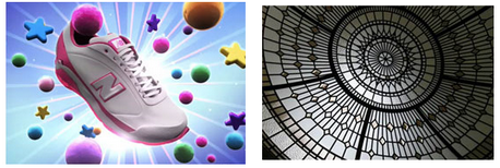
On square and rectangular pages, generally we place elements in orderly rows and columns. In radial designs, the elements radiate from or swirl in a circular or spiral path. Parts of the design must still be arranged so they are balanced across the width and length of the page unless the aim intentionally is a lack of balance. The running shoe below is at the centre of the design with the glow and burst of light and geometric shapes radiating from it. The ornate window is perfectly symmetrical but it is deliberately placed off-centre in the photo. The outlines edging off the page and to the right throw the image off-balance.
Underlying most of the previous layouts are three related aspects of page layout and balance. These are layout principles that help the designer achieve arrangements with visual balance.
Consider three additional types of balance: Rule of Thirds, visual centre, and grids.
Rule of Thirds
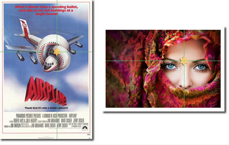
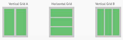
The rule of thirds says that most designs can be made more interesting by dividing the page visually into thirds vertically and/or horizontally and placing our most important elements within those thirds. Take this concept a step further by placing your most important elements at one or more of the four intersections of those dividing lines.
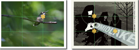
Most designers try to capture the main portion of the subject in the areas of the four main crossroads (as indicated by the yellow stars on the images above). Look at the examples and see how the rule of thirds is utilized in each.
- The hummingbird, which is the primary focus of the photograph, falls perfectly on the rule of thirds grid.
- In the asymmetrical layout, the name MIDLAKE appears in the lower third of the page and runs through an intersection of the rule of thirds. However, the emphasis is on the white face and hand of the largest figure, both of which are close to intersecting point on the rule of thirds grid.
Visual Center
Placing important elements or the focal point of the design within the visual centre of a piece is another design trick. The visual centre is slightly to the right of and above the actual centre of a page.
Grids
Dividing a page approximately into thirds or finding the visual centre are relatively easy. Usually, you do not have to be exact to achieve your goals. However, constructing the underlying structure of a piece is more complicated -- but it is essential for most designs. Most balanced designs (and even unbalanced ones) rely on a grid. This invisible structure (visible while working in your page layout program) helps ensure that you place all the elements in the right locations to achieve balance and to help with continuity and consistency of design. Grids can be simple or complex depending on the needs of the design and the designer.
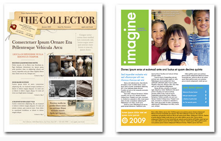
Sometimes the use of a grid is obvious. The asymmetrically balanced design in the following images of newsletters uses a combination of two and three column grids to ensure that each text column is the same width, and it uses graphics, photographs, and colour blocks to help achieve balance as well. In addition, the grid dictates the margins and ensures that the page number and header appear in the same place on each page.