Principles of Design
Emphasis
Emphasis is the art of making a specific element stand out. The designer can achieve emphasis by placing elements on the page in
positions where the eye is naturally drawn and by  using
other principles such as contrast, repetition, or movement. Bold and italic type can provide emphasis for text. Size, visual weight, colour, complexity, and uniqueness can provide emphasis for images.
using
other principles such as contrast, repetition, or movement. Bold and italic type can provide emphasis for text. Size, visual weight, colour, complexity, and uniqueness can provide emphasis for images.
Often, this technique is used on opening pages of magazine articles. If the layout grabs the viewers' attention with the dominant visual and introductory copy, viewers will continue reading.
Emphasis by Focal Point
A focal point draws one's attention to the most important element on the page. It is the most visible element (what the designer wants people to see first).
In photography, the focal point usually is found in the foreground.
Emphasis by Contrast
Value brings out the differences between a foreground (such as the wolf in the photo below), a mid-ground that may simply support, and a background that may be miles away. Value produces the illusion of form (
depth, height, and width). Value brings objects off the surface and makes them appear real.

Emphasis by Placement
Placing the most important part of an image off-centre or to the left or right and either above or below the centre line adds interest.
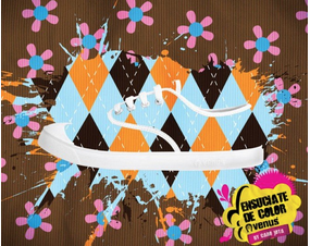
Are you having trouble finding the shoe?
Look for the white laces and sole in the dark brown, orange, and blue harlequin pattern.
Emphasis by Colour
Emphasis by Movement
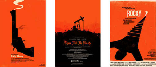
Designs on an angle or elements that produce the illusion of movement stand out. Consider the examples below. In photography and video, emphasis can imply movement by focusing on a subject that is moving.
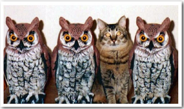
Emphasis by Difference
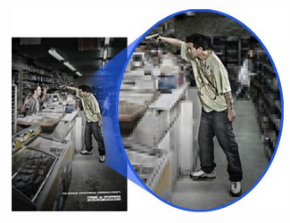
Designers use colour, shape, line, texture, value, space, and/or form in ways that distinguish one element or area from the whole. We notice things that do not fit into their environment. What doesn't belong in this photograph?
When striving for emphasis ...
Consider the following:
- As an element moves away from the centre of the page, it gains weight.
- An interesting element has more weight than a less-interesting one has.
- An element on the right-hand side of your layout has more weight than the same element on the left-hand side has.
- An element on the top of your layout has more weight than the same element on the bottom has.
- The more you isolate an element, the more weight it has.
- Regular shapes tend to have more weight than irregular shapes have.
Avoid ...
- Placing anything in the centre of your page (on any axis going in any direction, horizontal, vertical, diagonal)
- Placing any element in the centre of any other element
- Placing any element in the corner of the page or in the corner of another element
- Placing any element half on any other element
- Lining up elements on their centre