Principles of Design
Completion requirements
Proportion
Proportion is the relationship between two or more elements with respect to size, colour, quantity,
degree, setting, and other aspects. Proportion is ratio or scale. The relationship is said to be harmonious when a visually pleasing or desirable ratio is evident among the elements. Good
proportion adds harmony and symmetry, or balance, to a composition. Variation refers to changes in comparative sizes, shapes, and quantities.

When considering the size relationship of elements in a layout, the designer tries not to have everything the same size. Unequal divisions of space within the layout and elements of various sizes attract attention and elicit interest.
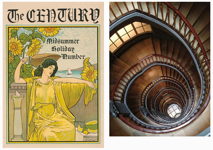
When a page is split horizontally or vertically, the 60/40 or 1/3 to 2/3 proportions are appropriate. Research shows these proportions are appealing to the eye; they reflect the Golden Ratio used in architecture and art since ancient Greek and Roman times.

In the instance of a relationship of size, a comparison is made between
- the height, width, and depth of one element to those of another element
- the size of one area to the size of another area
- the size of one element to the size of another element
- the amount of space between two or more elements
Proportion and Disharmony
Usually, we do not notice proportion until something is different. When the relative size of two elements being compared seems out of balance, they are said to be "out of proportion". Cartoon characters, for example, are often drawn out of proportion with some unduly large feature such as head, ears, or feet.
Bad proportion uses equal division of the shapes, which results in monotony and disharmony. Shapes should fit properly in their positions and spaces.


Proportion and Message
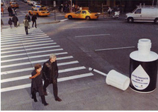
Sometimes, proportion is exaggerated to convey a message.
No person can hold the world in one hand, yet this image shows exactly that.

Liquid paper can be used to cover all sorts of things, but it is unlikely anyone would paint crosswalks with it.
When striving for good proportion ...
Consider the following:
- Place together elements that are similar in character or have some feature in common.
- Designate major and minor areas in the design. (Equal parts can become quickly monotonous and boring.)
- Arrange the space so that the eye does not perceive a standard mathematical relationship.
- Generate harmony by stressing the similarities of all parts.
Avoid ...
- Making size differences so great that the parts appear unrelated and out of harmony
- Dividing the composition in halves, quarters, and thirds