Typography
Sizing & Spacing
Typeface must be sized and spaced reasonably to be read easily.
Typeface size usually reflects the height of the lines of the type, but the inner dimensions of the letters have the greatest effect on readability. For this reason, we should select the type based on appearance and not purely on size.

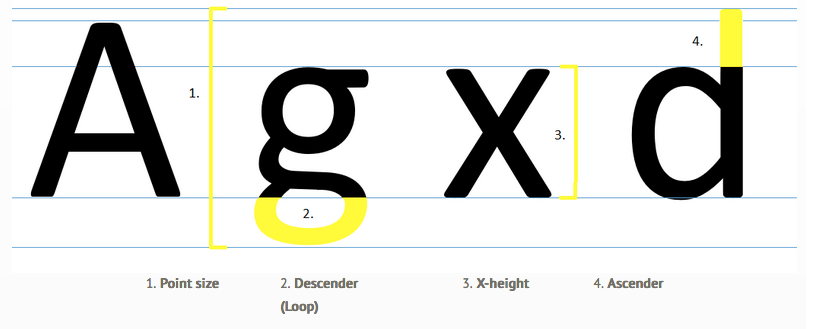
Typeface size (the distance from the ascender line to the descender line),
is measured in points. When the size of lowercase letters
(the x-height, 3. above), is larger than the ascender
height (4. above), more legible words fit into an equivalent space. The sizes of the five fonts shown in blue below
are all 18 points. Yet, word length and readability change with each typeface.

All font sizes are 18 pt. Note how the word length and readability change, despite the size remaining the same.
|
Leading (rhymes with bedding) is the vertical spacing between separate lines of type (the distance from baseline to baseline). Longer lines require more leading to prevent the reader's eye from slipping up or down when moving from the end of one line to the beginning of the next. Then, logically, short lines are preferable if information density is important, as in a newspaper. |
 |